What makes Human Experience?

How would we begin to describe this experience?
- Where / When?
- Who?
- How?
- How Big? How small? How frequent? How sudden?
- And....How Surprising ! How Shocking! How sad...How Wonderful !!!
So: Our Questions, and our Surprise lead us to creating Human Experiences.
Is This a Surprise?

- Do Emotions lead to Data?
- How do I measure/quantify my emotions?
The Element of Surprise?

Jane Austen knew a lot about human information processing as these snippets from Pride and Prejudice (published in 1813 -- over 200 years ago) show:
- She was a woman of mean understanding, little information, and uncertain temper.
- Catherine and Lydia had information for them of a different sort.
- When this information was given, and they had all taken their seats, Mr. Collins was at leisure to look around him and admire,...
- You could not have met with a person more capable of giving you certain information on that head than myself, for I have been connected with his family in a particular manner from my infancy.
- This information made Elizabeth smile, as she thought of poor Miss Bingley.
- This information, however, startled Mrs. Bennet ...
Claude Shannon and Information

Clause Shannon, the father of modern telecom
- Defined information/data as "quantified surprise"
- "There was traffic in Bangalore today"(meh)
- "There was hail in Bangalore today"(😮)
- "There was snow in Bangalore today"(😱)
Human Experience is....Data??

But Can't We "Generate" Data Ourselves? Sure we can!

- We create Hypotheses, and then Experiments
- A Kitchen Experiment
- Inputs are: Ingredients, Recipes, Processes
- Outputs are: Taste, Texture, Colour, Quantity!!
A Famous Lady and her Famous Experiment

In 1853, Turkey declared war on Russia. After the Russian Navy destroyed a Turkish squadron in the Black Sea, Great Britain and France joined with Turkey. In September of the following year, the British landed on the Crimean Peninsula and set out, with the French and Turks, to take the Russian naval base at Sevastopol.
What followed was a tragicomedy of errors -- failure of supply, failed communications, international rivalries. Conditions in the armies were terrible, and disease ate through their ranks. They finally did take Sevastopol a year later, after a ghastly assault. It was ugly business all around. Well over half a million soldiers lost their lives during the Crimean War.
| Month | Year | Disease.rate | Wounds.rate | Other.rate |
|---|---|---|---|---|
| Apr | 1854 | 1.4 | 0.0 | 7.0 |
| May | 1854 | 6.2 | 0.0 | 4.6 |
| Jun | 1854 | 4.7 | 0.0 | 2.5 |
| Jul | 1854 | 150.0 | 0.0 | 9.6 |
| Aug | 1854 | 328.5 | 0.4 | 11.9 |
| Sep | 1854 | 312.2 | 32.1 | 27.7 |
| Oct | 1854 | 197.0 | 51.7 | 50.1 |
| Nov | 1854 | 340.6 | 115.8 | 42.8 |
| Dec | 1854 | 631.5 | 41.7 | 48.0 |
| Jan | 1855 | 1022.8 | 30.7 | 120.0 |
What Makes a Good Vegetable Variable, then?

Each kind of variable answers to a different Interrogative Pronoun
- ''Whose was it?'' ''His who is gone.''
- ''Who shall have it?'' ''He who will come.''
- ''Where was the sun?'' ''Over the oak.''
- ''Where was the shadow?'' ''Under the elm.''
- ''How was it stepped?'' ''North by ten and by ten, east by five and by five, south by two and by two, west by one and by one, and so under.''
- ''What shall we give for it?'' ''All that is ours.''
- ''Why should we give it?'' ''For the sake of the trust.''
Types of Variables
Using Interrogative Pronouns
Nominal: What? Who? Where? (Just names)
Ordinal: Which Types? What Sizes? How Big? (Factors, Dimensions)
Interval: How Often? (Numbers, Facts)
Ratio: How many? How much? How heavy? (Numbers, Facts)

Another Way of Looking at Variables

Types of Variables in Nightingale Data
- Nominal: None
- Ordinal: (Factors, Dimensions)
- HOW?
War, Disease, Other!!
- HOW?
- Interval: (Numbers, Facts)
- WHEN?
Year, Month
- WHEN?
- Ratio: (Numbers, Facts)
- HOW MANY?
Rates of Deaths(War, Disease, Other)
- HOW MANY?
| Month | Year | Disease.rate | Wounds.rate | Other.rate |
|---|---|---|---|---|
| Apr | 1854 | 1.4 | 0 | 7.0 |
| May | 1854 | 6.2 | 0 | 4.6 |
| Jun | 1854 | 4.7 | 0 | 2.5 |
Tidy Data

Nightingale's data table had dimensions (i.e. types of deaths) coded into column names. This is not considered tidy, though some software packages use this wide form data.
Nightingale's Rose

Yes, But Why? Shapes and Data Viz Culture
- Each Data Vis answers a Question
- We can digest information more easily when it is pictorial
- Our Working Memories are both short-term and limited in capacity.
- So a picture abstracts the details and presents us with an overall summary, an insight, or a story that is both easy to recall and easy on retention.
- Data Viz includes shapes that carry strong cultural memories; and impressions for us.
- These cultural memories help us to use data viz in a universal way to appeal to a wide variety of audiences.

Visualization: A Metaphor from Data -> Geometry
How did we arrive at shapes, colours, lines, points...from data?
All Statistical Graphs do a Kalidasa
They use metaphors to map data variables and computed stats to geometrical aspects aka aesthetics
They may also compute stuff with data before plotting, as we shall see
Shapes have Cultural Significance
We may all have a Gene for Geometry

Shapes in Data Viz

Geometric Aesthetics in Data Viz
Commonly used aesthetics in data visualization: position, shape, size, color, line width, line type...
Some of these aesthetics can represent both continuous and discrete data (position, size, line width, color)
While others can usually only represent discrete data (shape, line type).

Each of the geometries works differently
Amounts and Counts
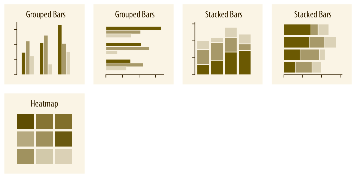
- Variable: Ordinal / Nominal
- Stat:
count - Geometry:
- x: Ord/Nom; y = count = height; colour = Ord/Nom
- Questions:
- How many artists work with each Type of Material?
- Broken up by Gender or Nationality?
- Do
girls outnumber boys(meh!) Introverts outnumber Extraverts in Srishti 4:1 ? - And from metros?
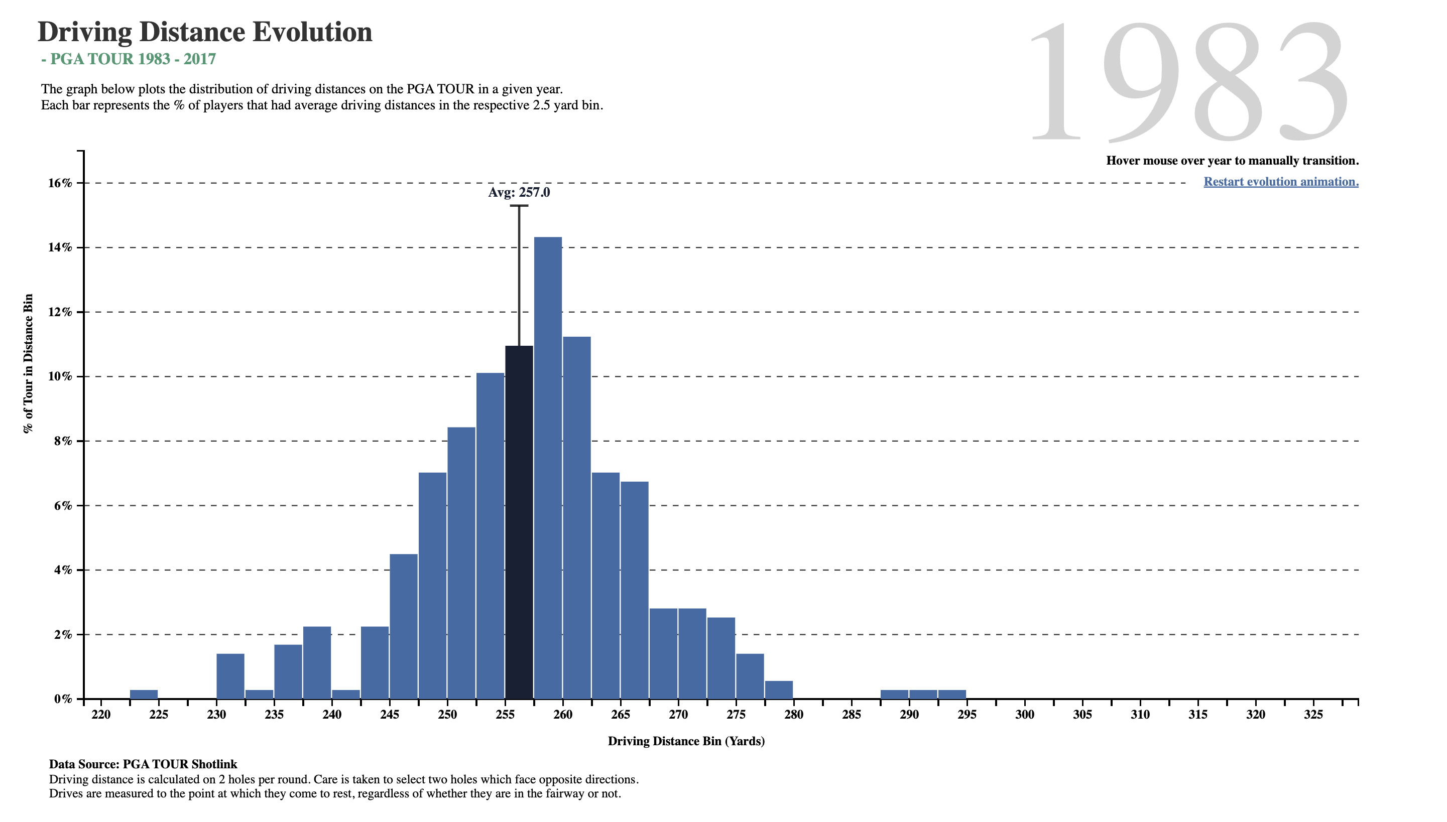
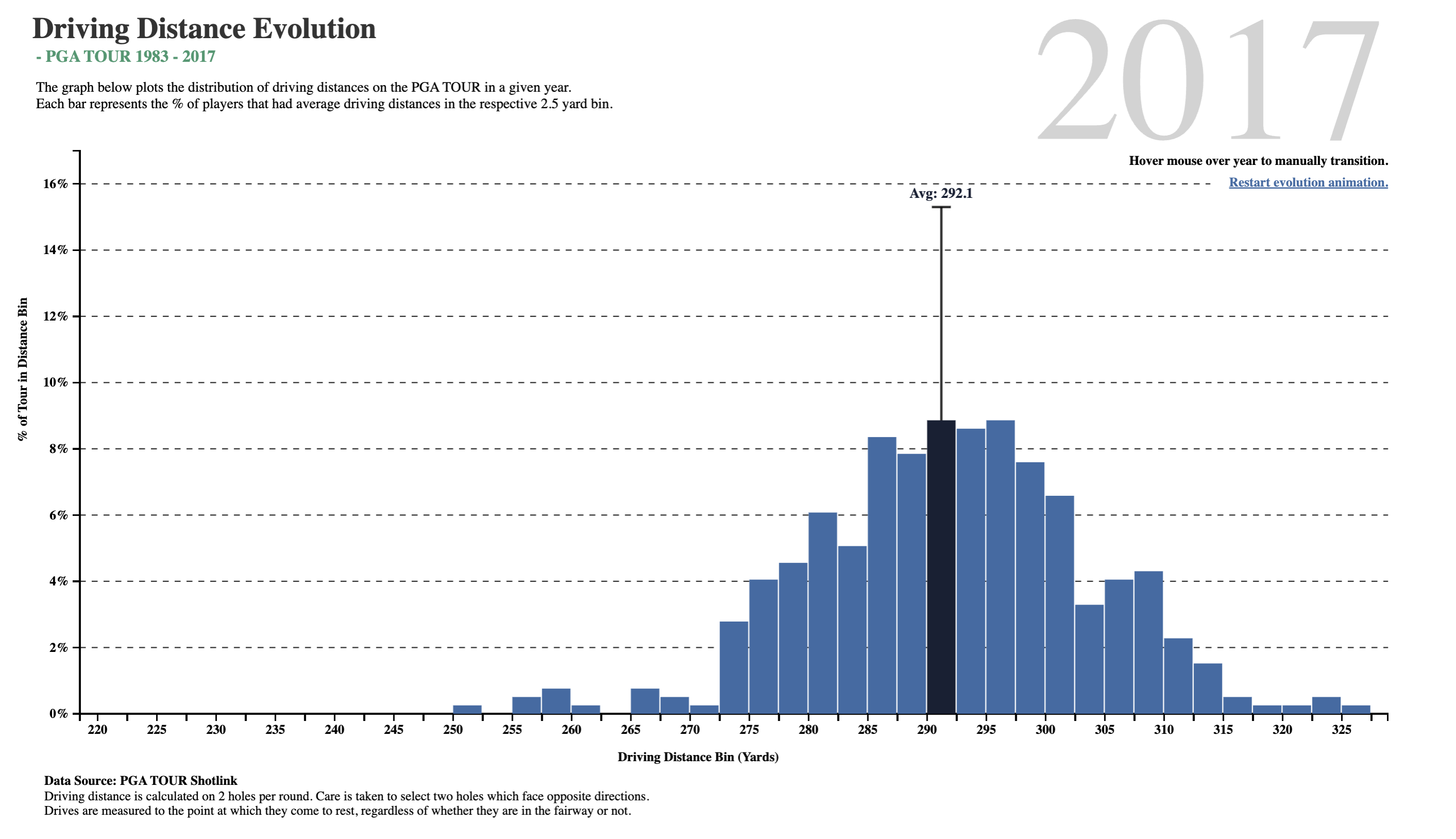
Distributions
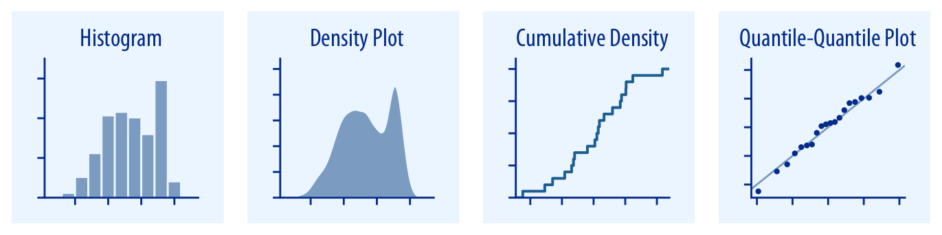
- Variable: Interval / Ratio
- Stat:
binandcount - Geometry:
- x = bins ( Quant ranges)
- y = count
- colour = nothing, or Nom/Ord
- Questions:
- What is the Range and frequency of Interval/Ratio variable?
- Do men and women
boxplay golf differently?
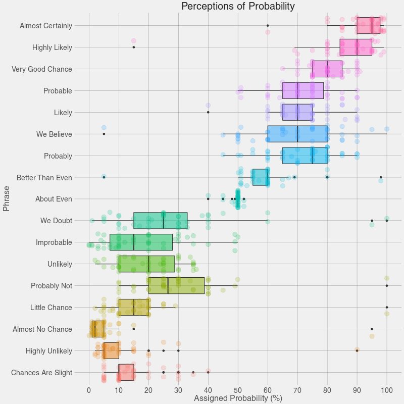
Grouped Distributions
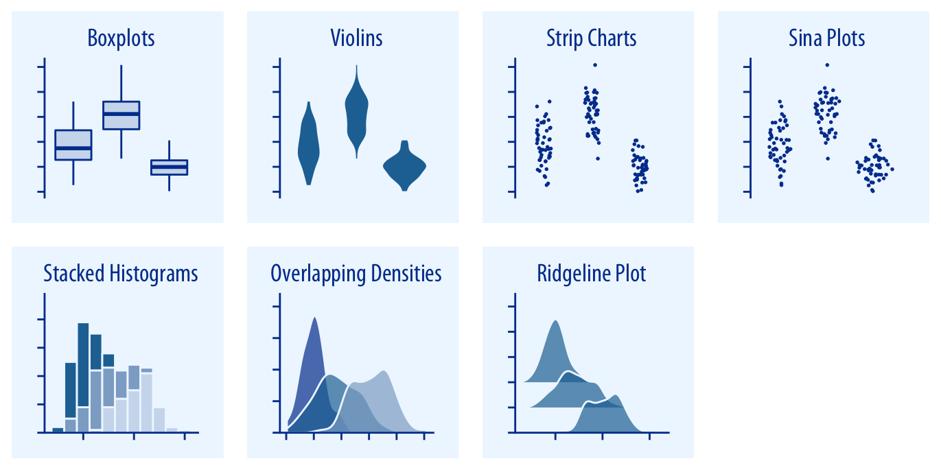
- Variable: Interval/Ratio + Nominal/Ordinal
- Stat:
sort(boxplot),bin(violin) - Geometry:
- x = Int/Ratio,
- y = Nom/Ord, and
- colour = Nom/Ord
- Question:
- What is the distribution of the Interval/Ratio variable?
- Grouped by an Ord/Nom variable?
- Does "bruh" mean the same thing in every building in SMI?
- Which building in SMI is voted the most ugly? (Rust, Rack, Ruin, WReck, Reject?)
I say what I mean, and I mean what I say
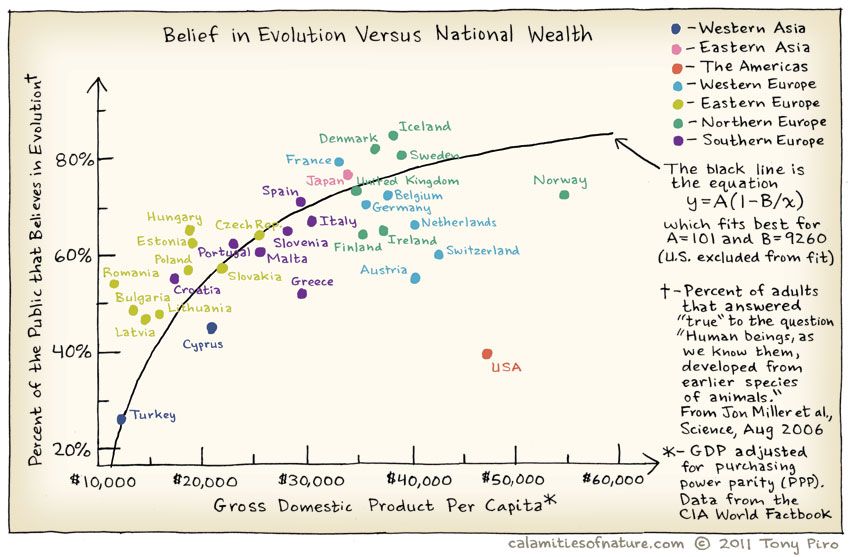
Relationships
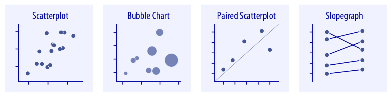
- Variable: Interval/Ratio + Nominal/Ordinal
- Stat: none
- Geometry:
- x = Int/Ratio,
- y = Int/Ratio, and
- colour = Nom/Ord
- shape = Nom/Ord
- Question:
- How does one Interval/Ratio variable vary with respect to another?
- Are the number of friendships dependent upon my wallet-size?
Change, Evolution, and Flow
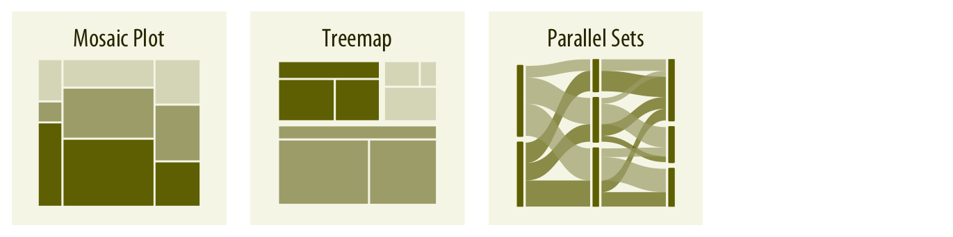
- Variables: Nominal/Ordinal
- Stat: none
- Geometry:
- x = Nom/Ord
- y = Count (computed)
- colour = Nom/Ord
- width = Count (computed)
- Question:
- How do counts vary over (combinations of) Ord/Nom variables?
- Could Jack have lived happily ever after with Rose?

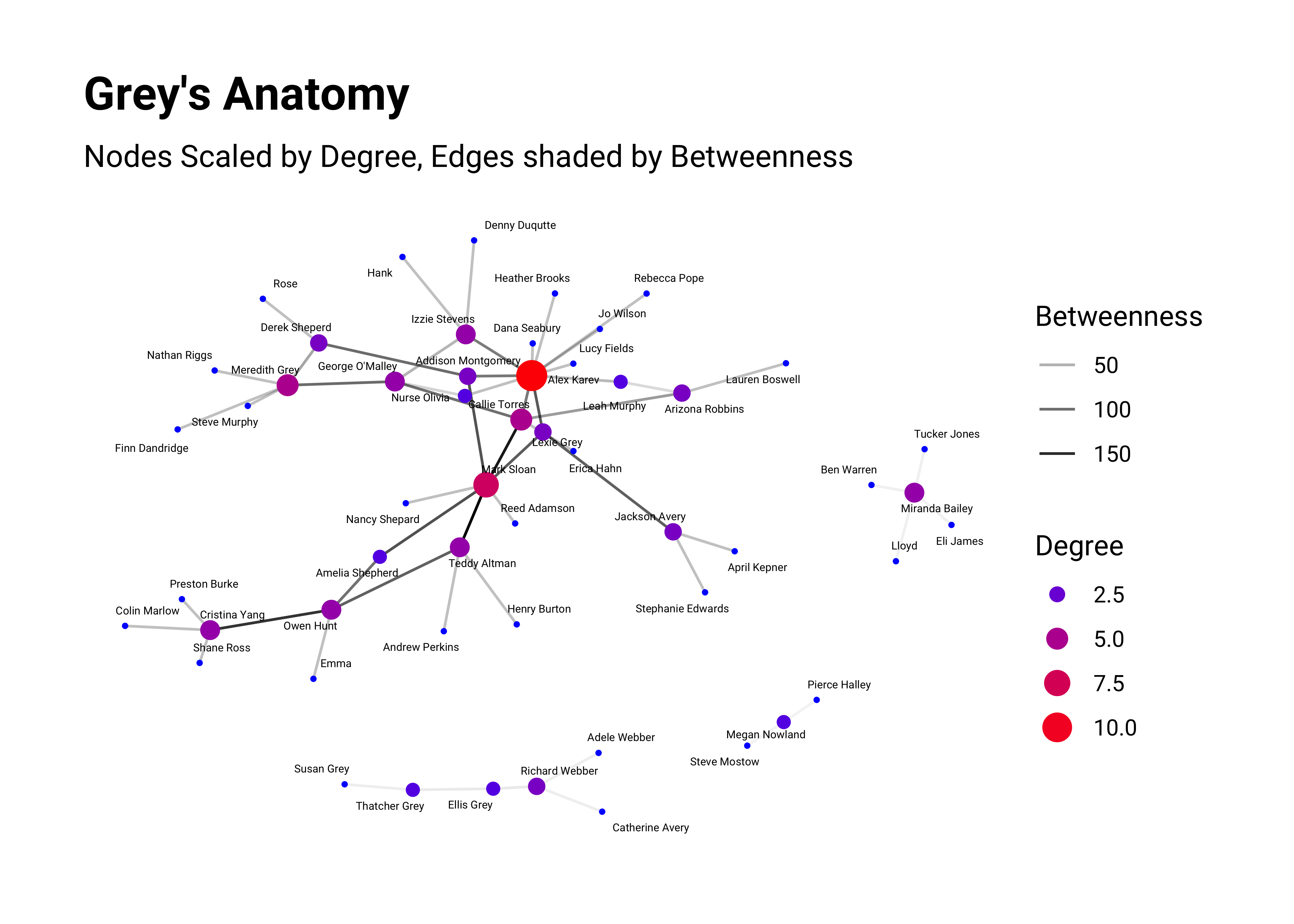
Networks
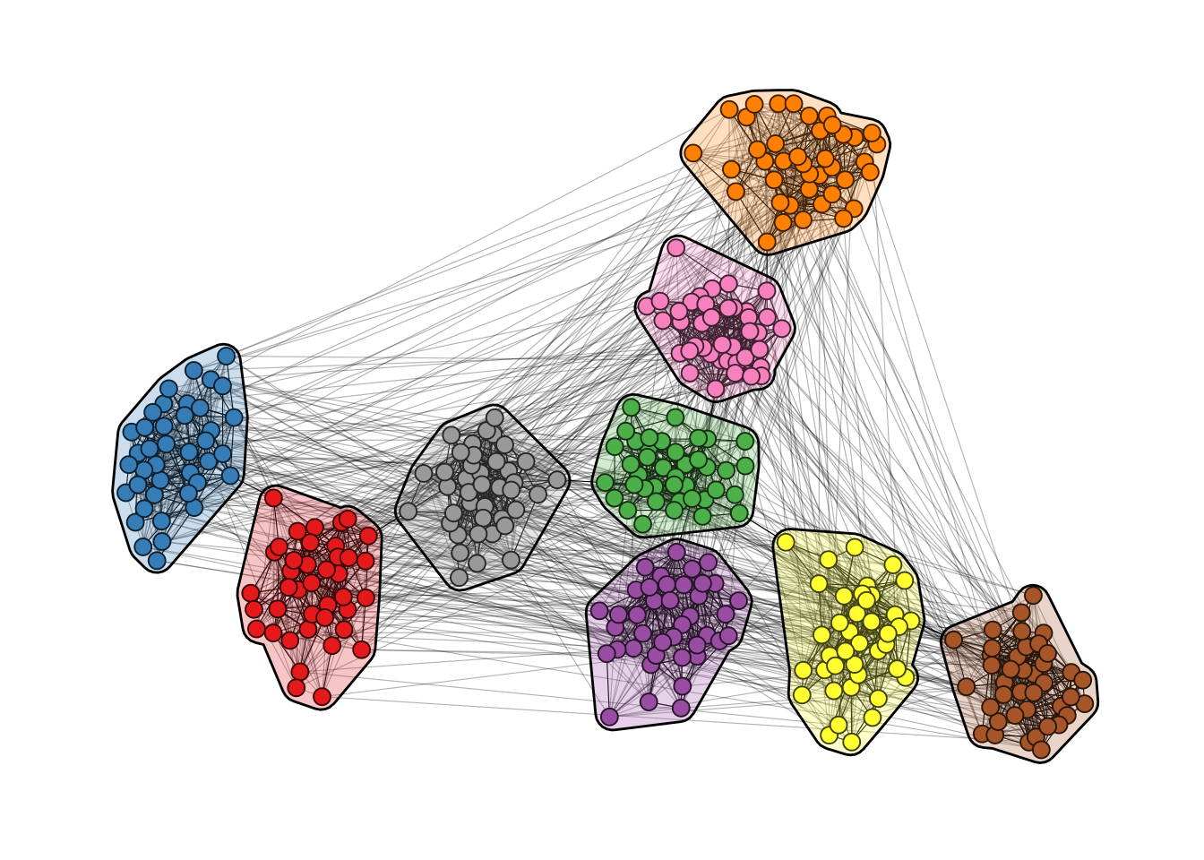
- Variables: Nominal/Ordinal
- Stat: none
- Geometry:
- Node (shape) = Nom
- Colour = Ord
- Edge Line width = Count (computed) or Quant
- Question:
- How much does on Qual variable connect with another?
- What is the strength of someone's friendship with another?
- Are friendships, ah, "beneficial"?
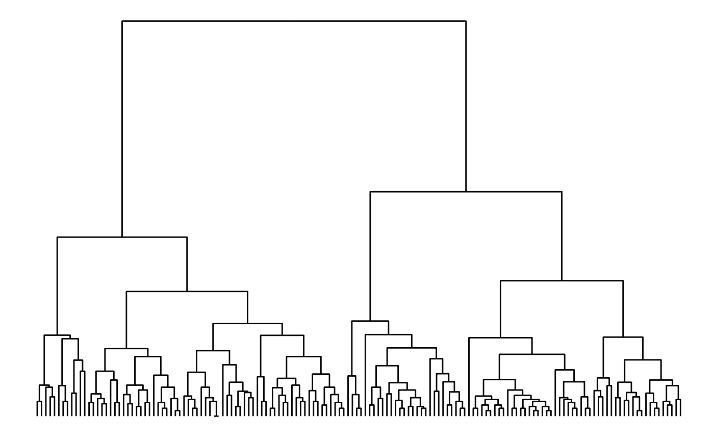
Hierarchies

- Variables: Nominal/Ordinal
- Stat: none
- Geometry:
- x = Nom/Ord
- y = Nom/Ord
- Question:
- How much does on Qual variable connect with another?
- Who reports to whom, or is dependent upon whom?
- Who cannot pass the buck any further?
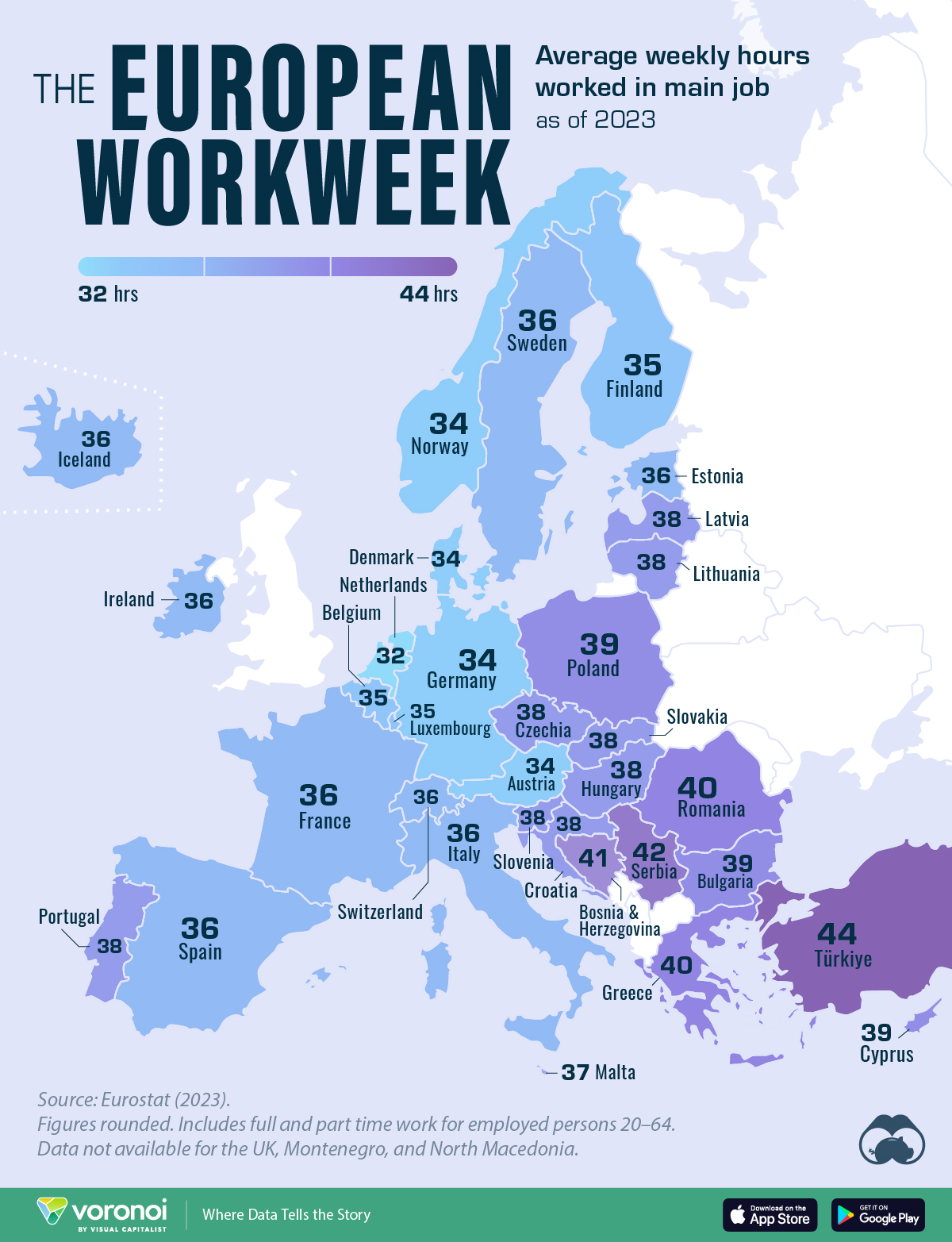
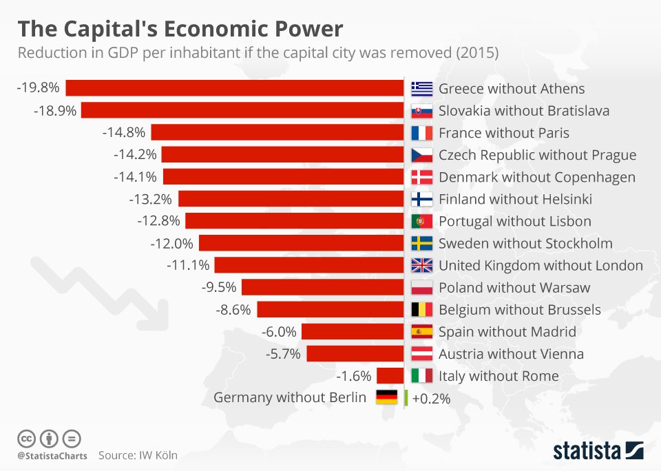
Maps
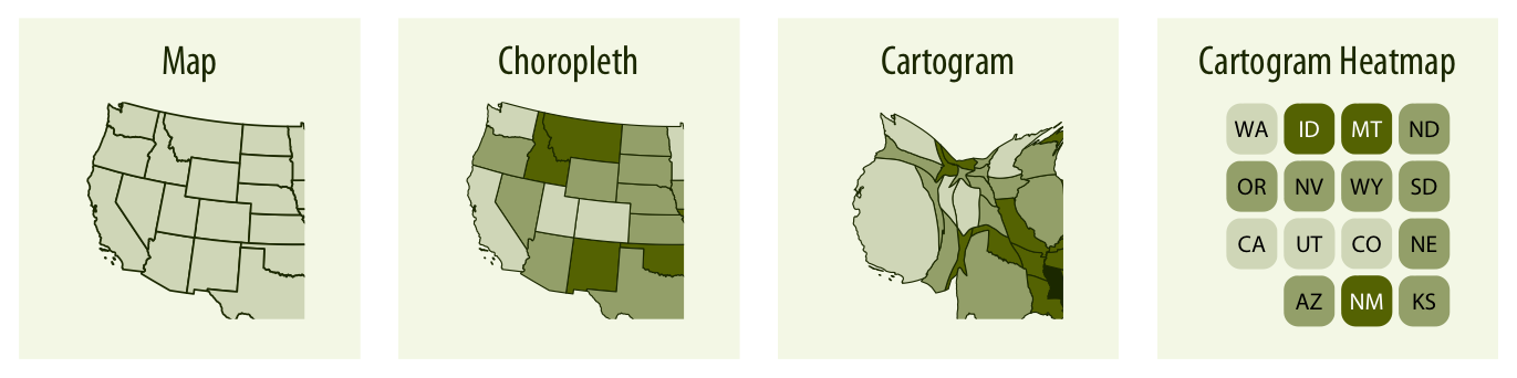
- Variables: Quant + Qual (Nominal/Ordinal)
- Stat: none
- Geometry:
- x = Quant
- y = Quant
- colour = Nom/Ord
- Question:
- What does each area represent, qualitatively? (Religion, Properity, Voting Pattern..)
- Which are the most affluent, or crime-prone neighbourhoods?
- Who watches Brooklyn 99 and who watches Bojack Horseman?