🕔 Time Series
Time Series

Introduction
Any metric that is measured over regular time intervals forms a time series. Analysis of Time Series is commercially important because of industrial need and relevance, especially with respect to Forecasting (Weather data, sports scores, population growth figures, stock prices, demand, sales, supply…). In the graph shown below is the temperature over times in two US cities:
A time series can be broken down to its components so as to systematically understand, analyze, model and forecast it. We have to begin by answering fundamental questions such as:
- What are the types of time series?
- How to decompose it? How to extract a level, a trend, and seasonal components from a time series?
- What is auto correlation etc.
- What is a stationary time series?
- And, how do you plot time series?
Introduction to Time Series: Data Formats
There are multiple formats for time series data.
Tibble format: the simplest is of course the standard tibble/ dataframe, with a
timevariable to indicate that the other variables vary with time.The
tsformat: Thestats::ts()function will convert a numeric vector into an R time seriestsobject.The modern
tsibbleformat: this is a new format for time series analysis, and is used by the tidyverts set of packages.The base
tsobject is used by established packagesforecastThe standard tibble object is used by
timetk&modeltimeThe special
tsibbleobject (“time series tibble”) is used byfable,feastsand others from thetidyvertsset of packages
Creating and Plotting Time Series
In this first example, we will use simple ts data first, and then do
another with tsibble format, and then a third example with a tibble that we can plot as is and do more after conversion to tsibble format.
ts format data
There are a few datasets in base R that are in ts format already.
AirPassengers## Jan Feb Mar Apr May Jun Jul Aug Sep Oct Nov Dec
## 1949 112 118 132 129 121 135 148 148 136 119 104 118
## 1950 115 126 141 135 125 149 170 170 158 133 114 140
## 1951 145 150 178 163 172 178 199 199 184 162 146 166
## 1952 171 180 193 181 183 218 230 242 209 191 172 194
## 1953 196 196 236 235 229 243 264 272 237 211 180 201
## 1954 204 188 235 227 234 264 302 293 259 229 203 229
## 1955 242 233 267 269 270 315 364 347 312 274 237 278
## 1956 284 277 317 313 318 374 413 405 355 306 271 306
## 1957 315 301 356 348 355 422 465 467 404 347 305 336
## 1958 340 318 362 348 363 435 491 505 404 359 310 337
## 1959 360 342 406 396 420 472 548 559 463 407 362 405
## 1960 417 391 419 461 472 535 622 606 508 461 390 432str(AirPassengers)## Time-Series [1:144] from 1949 to 1961: 112 118 132 129 121 135 148 148 136 119 ...This can be easily plotted using base R:
plot(AirPassengers)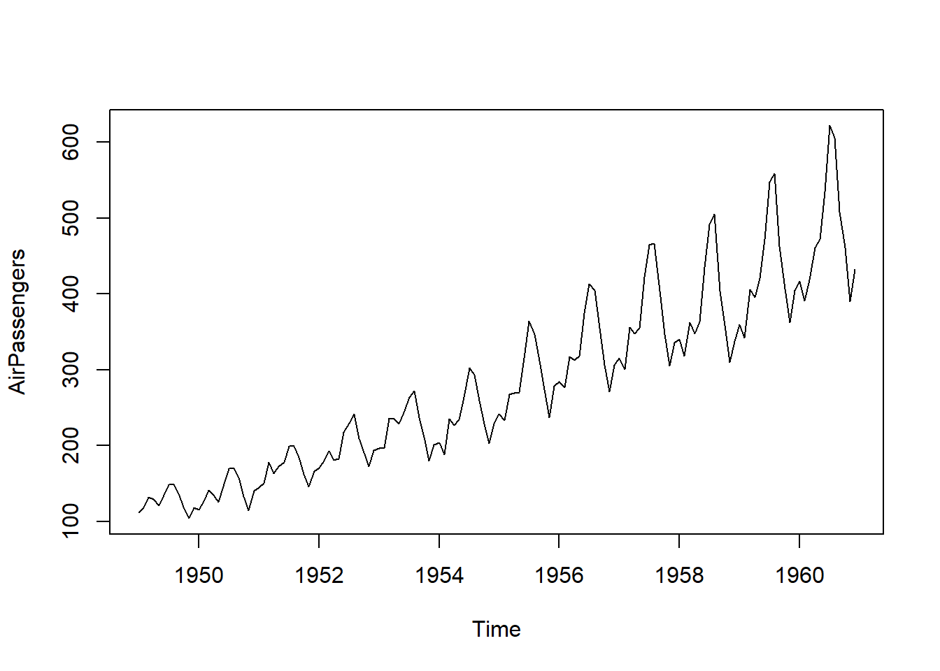
One can see that there is an upward trend and also seasonal variations that also increase over time.
Let us take data that is “time oriented” but not in ts format: the
syntax of ts() is:
Syntax:  objectName <- ts(data, start, end, frequency)

where,

    `data`: represents the data vector
    `start`: represents the first observation in time series
    `end`: represents the last observation in time series
    `frequency`: represents number of observations per unit time. For
    example 1=annual, 4=quarterly, 12=monthly, etc.
We will pick simple numerical vector data variable from trees:
trees## Girth Height Volume
## 1 8.3 70 10.3
## 2 8.6 65 10.3
## 3 8.8 63 10.2
## 4 10.5 72 16.4
## 5 10.7 81 18.8
## 6 10.8 83 19.7
## 7 11.0 66 15.6
## 8 11.0 75 18.2
## 9 11.1 80 22.6
## 10 11.2 75 19.9
## 11 11.3 79 24.2
## 12 11.4 76 21.0
## 13 11.4 76 21.4
## 14 11.7 69 21.3
## 15 12.0 75 19.1
## 16 12.9 74 22.2
## 17 12.9 85 33.8
## 18 13.3 86 27.4
## 19 13.7 71 25.7
## 20 13.8 64 24.9
## 21 14.0 78 34.5
## 22 14.2 80 31.7
## 23 14.5 74 36.3
## 24 16.0 72 38.3
## 25 16.3 77 42.6
## 26 17.3 81 55.4
## 27 17.5 82 55.7
## 28 17.9 80 58.3
## 29 18.0 80 51.5
## 30 18.0 80 51.0
## 31 20.6 87 77.0# Choosing the `height` variable
trees_ts <- ts(trees$Height,
frequency = 1, # No reason to believe otherwise
start = 1980) # Arbitrarily picked "1980" !
plot(trees_ts)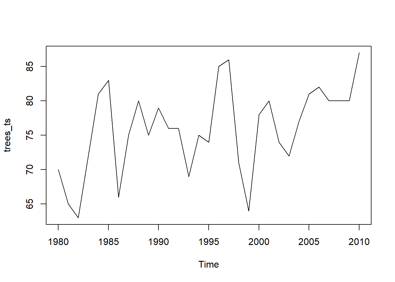 ( Note that this example is just for demonstration: tree heights do not decrease over time!!)
tsibble data
The package tsibbledata contains several ready made tsibble format data. Run data(package = "tsibbledata") to find out about these.
Let us try PBS which is a dataset containing Monthly Medicare prescription data in Australia.
data("PBS")This is a large dataset, with 1M observations, for 336 combinations of key variables. Data appears to be monthly. Note that there is more than one quantitative variable, which one would not be able to support in the ts format.
There are multiple Quantitative variables ( Scripts and Cost). The Qualitative Variables are described below. (Type help("PBS") in your Console)
The data is disaggregated using four keys:
Concession: Concessional scripts are given to pensioners, unemployed, dependents, and other card holders
Type: Co-payments are made until an individual’s script expenditure hits a threshold ($290.00 for concession, $1141.80 otherwise). Safety net subsidies are provided to individuals exceeding this amount.
ATC1: Anatomical Therapeutic Chemical index (level 1) ATC2: Anatomical Therapeutic Chemical index (level 2)
Let us simply plot Cost over time:
PBS %>% ggplot(aes(x = Month, y = Cost)) +
  geom_point() +
  geom_line()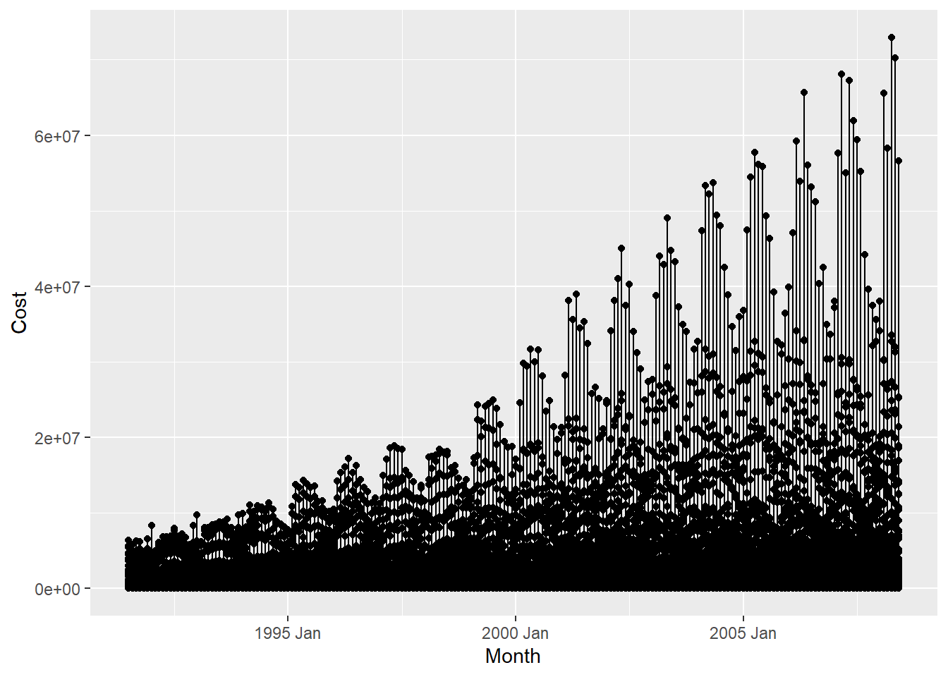
This basic plot is quite messy. We ought to use dplyr to filter the data using some combination of the Qualitative variables( 336 combinations!). Let us try that now:
PBS %>% count(ATC1, ATC2, Concession, Type)## # A tibble: 336 × 5
## ATC1 ATC2 Concession Type n
## <chr> <chr> <chr> <chr> <int>
## 1 A A01 Concessional Co-payments 204
## 2 A A01 Concessional Safety net 204
## 3 A A01 General Co-payments 204
## 4 A A01 General Safety net 204
## 5 A A02 Concessional Co-payments 204
## 6 A A02 Concessional Safety net 204
## 7 A A02 General Co-payments 204
## 8 A A02 General Safety net 204
## 9 A A03 Concessional Co-payments 204
## 10 A A03 Concessional Safety net 204
## # … with 326 more rowsWe have 336 combinations of Qualitative variables, each containing 204 observations: so let us filter for a few such combinations and plot:
PBS %>% dplyr::filter(Concession == "General",
                      ATC1 == "A",
                      ATC2 == "A10") %>%
  ggplot(aes(x = Month, y = Cost, colour = Type)) +
  geom_line() +
  geom_point()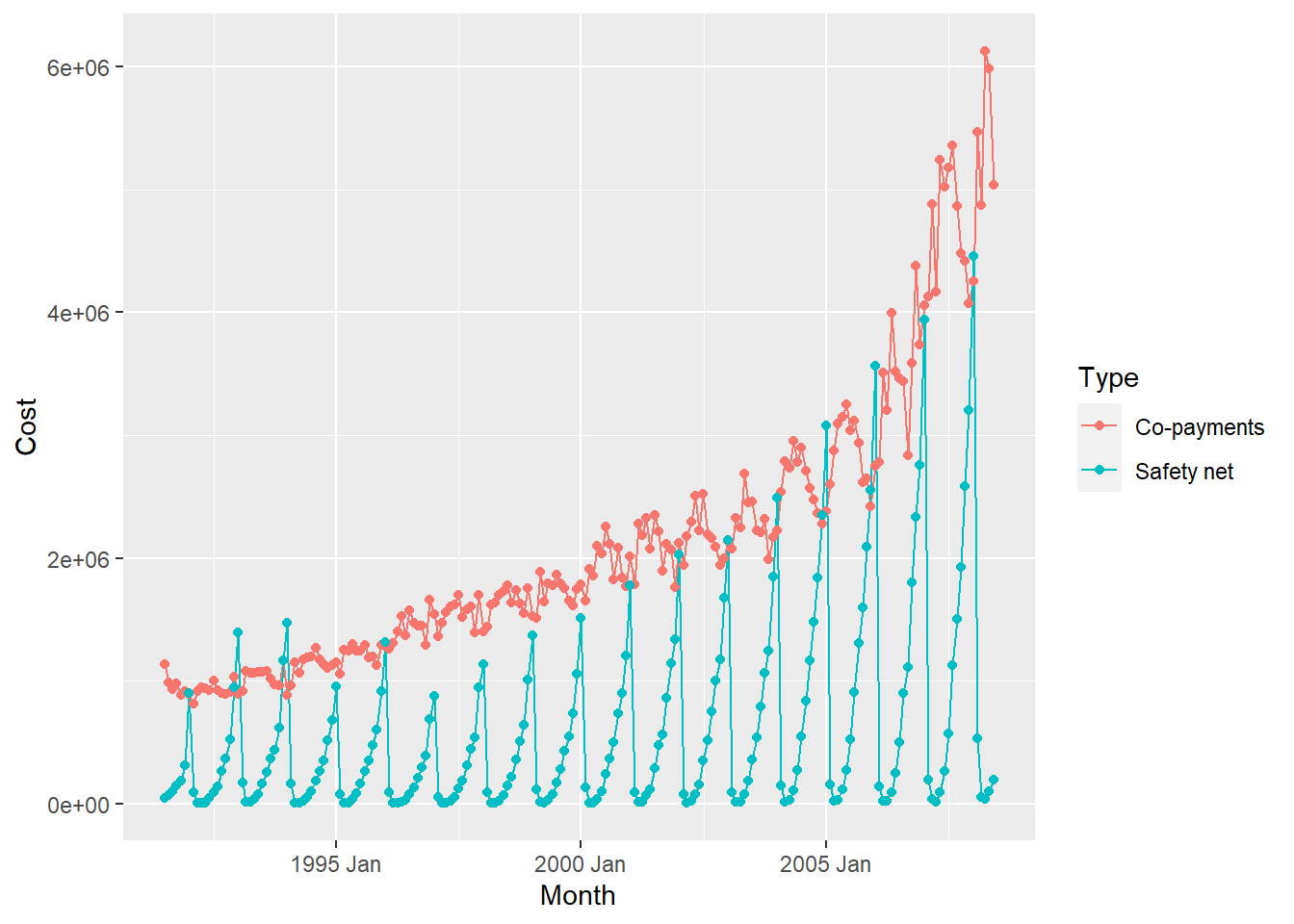
As can be seen, very different time patterns based on the two Types of
payment methods. Strongly seasonal for both, with seasonal variation increasing over the years, but there is an upward trend with the Co-payments method of payment.
tibble data
Let us read and inspect in the US births data from 2000 to 2014. Download this data by clicking on the icon below, and saving the downloaded file in a sub-folder called data inside your project:
Read this data in:
## Rows: 5,479
## Columns: 5
## $ year          <dbl> 2000, 2000, 2000, 2000, 2000, 2000, 2000, 2000, 2000, 20…
## $ month         <dbl> 1, 1, 1, 1, 1, 1, 1, 1, 1, 1, 1, 1, 1, 1, 1, 1, 1, 1, 1,…
## $ date_of_month <dbl> 1, 2, 3, 4, 5, 6, 7, 8, 9, 10, 11, 12, 13, 14, 15, 16, 1…
## $ day_of_week   <dbl> 6, 7, 1, 2, 3, 4, 5, 6, 7, 1, 2, 3, 4, 5, 6, 7, 1, 2, 3,…
## $ births        <dbl> 9083, 8006, 11363, 13032, 12558, 12466, 12516, 8934, 794…
So there are several numerical variables for year, month, and day_of_month, day_of_week, and of course the births on a daily basis. We will create a date column with these separate ones above, and then plot the births, say for the month of March, in each year:
## # A tsibble: 5,479 x 4 [1D]
##    date       births date_of_month day_of_week
##    <date>      <dbl>         <dbl>       <dbl>
##  1 2000-01-01   9083             1           6
##  2 2000-01-02   8006             2           7
##  3 2000-01-03  11363             3           1
##  4 2000-01-04  13032             4           2
##  5 2000-01-05  12558             5           3
##  6 2000-01-06  12466             6           4
##  7 2000-01-07  12516             7           5
##  8 2000-01-08   8934             8           6
##  9 2000-01-09   7949             9           7
## 10 2000-01-10  11668            10           1
## # … with 5,469 more rows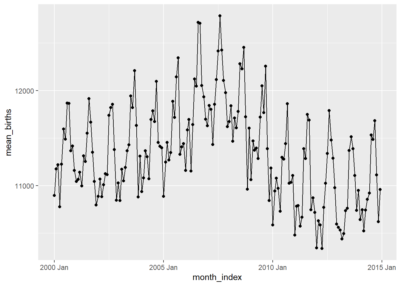
Hmm…can we try to plot box plots over time (Candle-Stick Plots)? Over month / quarter or year?
# Monthly box plots
births_tsibble %>%
  index_by(month_index = ~ yearmonth(.)) %>% # 180 months over 15 years
  # No need to summarise, since we want boxplots per year / month
  ggplot(., aes(y = births, x = date,
                group =  month_index)) + # plot the groups

geom_boxplot(aes(fill = month_index)) # 180 plots!! 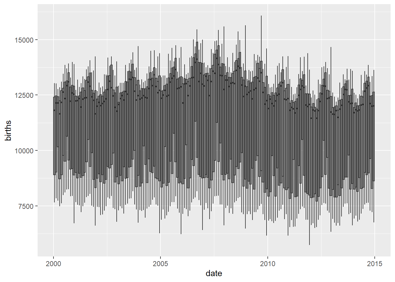
# Quarterly boxplots
births_tsibble %>%
  index_by(qrtr_index = ~ yearquarter(.)) %>% # 60 quarters over 15 years
  # No need to summarise, since we want boxplots per year / month
  ggplot(., aes(y = births, x = date,
                group = qrtr_index)) +

  geom_boxplot(aes(fill = qrtr_index))        # 60 plots!!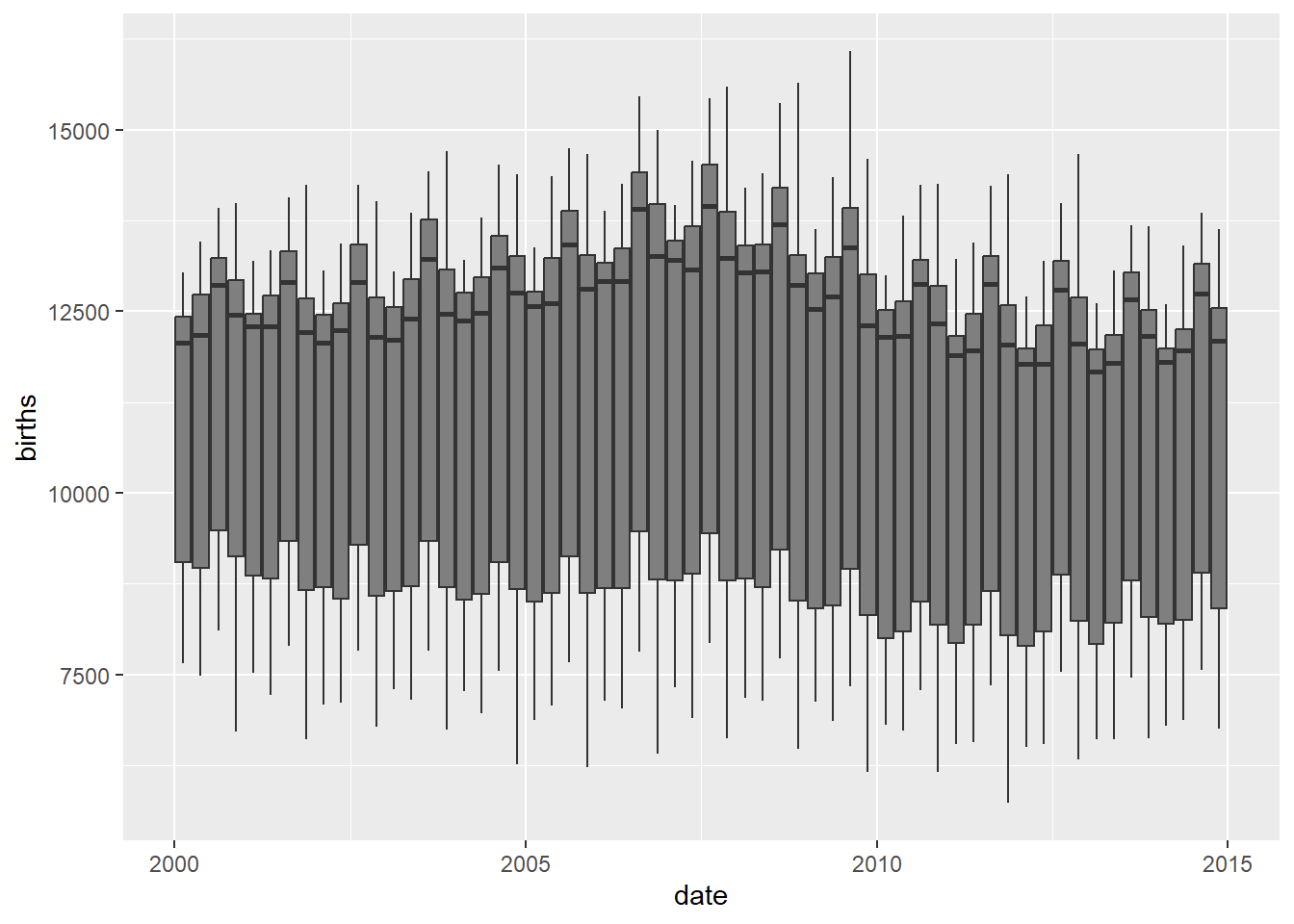
# Yearwise boxplots
births_tsibble %>%
  index_by(year_index = ~ lubridate::year(.)) %>% # 15 years, 15 groups
    # No need to summarise, since we want boxplots per year / month

  ggplot(., aes(y = births,
                x = date,
                group = year_index)) + # plot the groups

  geom_boxplot(aes(fill = year_index)) +           # 15 plots
  scale_fill_distiller(palette = "Spectral")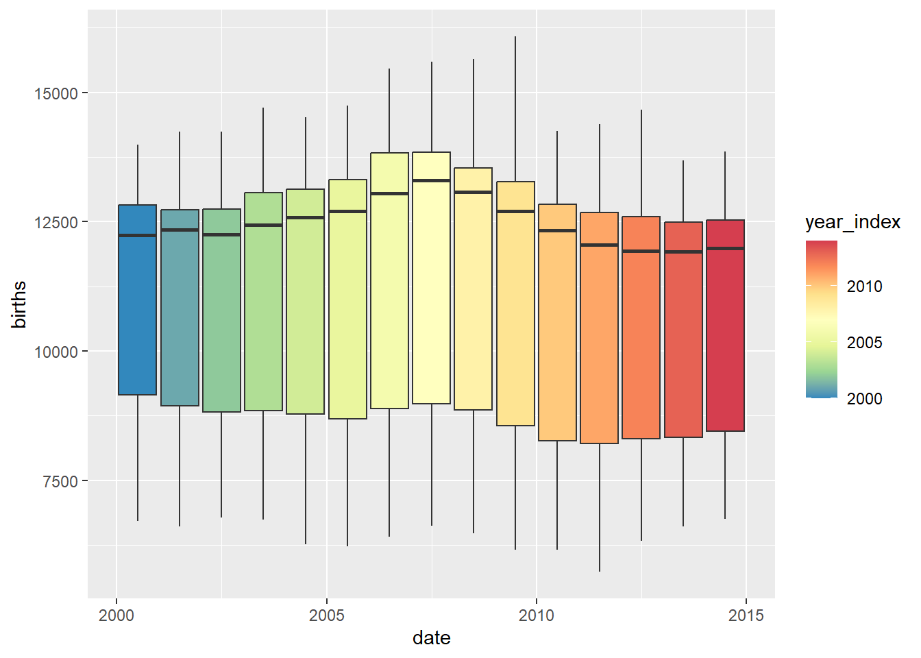
Although the graphs are very busy, they do reveal seasonality trends at different periods.
Seasons, Trends, Cycles, and Random Changes
Trend A trend exists when there is a long-term increase or decrease in the data. It does not have to be linear. Sometimes we will refer to a trend as “changing direction”, when it might go from an increasing trend to a decreasing trend.
Seasonal A seasonal pattern occurs when a time series is affected by seasonal factors such as the time of the year or the day of the week. Seasonality is always of a fixed and known period. The monthly sales of drugs ( with the PBD data ) shows seasonality which is induced partly by the change in the cost of the drugs at the end of the calendar year.
Cyclic A cycle occurs when the data exhibit rises and falls that are not of a fixed frequency. These fluctuations are usually due to economic conditions, and are often related to the “business cycle”. The duration of these fluctuations is usually at least 2 years.
Let us try to find and plot these patterns in Time Series.
births_STL_yearly <- births_tsibble %>%
  fabletools::model(STL(births ~ season(period = "year")))

fabletools::components(births_STL_yearly)
## # A dable: 5,479 x 7 [1D]
## # Key: .model [1]
## # : births = trend + season_year + remainder
## .model date births trend seaso…¹ remai…² seaso…³
## <chr> <date> <dbl> <dbl> <dbl> <dbl> <dbl>
## 1 "STL(births ~ season(period… 2000-01-01 9083 11312. -579. -1650. 9662.
## 2 "STL(births ~ season(period… 2000-01-02 8006 11312. -3119. -187. 11125.
## 3 "STL(births ~ season(period… 2000-01-03 11363 11312. -1389. 1440. 12752.
## 4 "STL(births ~ season(period… 2000-01-04 13032 11313. -404. 2124. 13436.
## 5 "STL(births ~ season(period… 2000-01-05 12558 11313. -209. 1454. 12767.
## 6 "STL(births ~ season(period… 2000-01-06 12466 11313. -203. 1357. 12669.
## 7 "STL(births ~ season(period… 2000-01-07 12516 11313. -266. 1469. 12782.
## 8 "STL(births ~ season(period… 2000-01-08 8934 11313. -491. -1888. 9425.
## 9 "STL(births ~ season(period… 2000-01-09 7949 11313. -326. -3038. 8275.
## 10 "STL(births ~ season(period… 2000-01-10 11668 11313. -75.8 431. 11744.
## # … with 5,469 more rows, and abbreviated variable names ¹season_year,
## # ²remainder, ³season_adjustfeasts::autoplot(components(births_STL_yearly))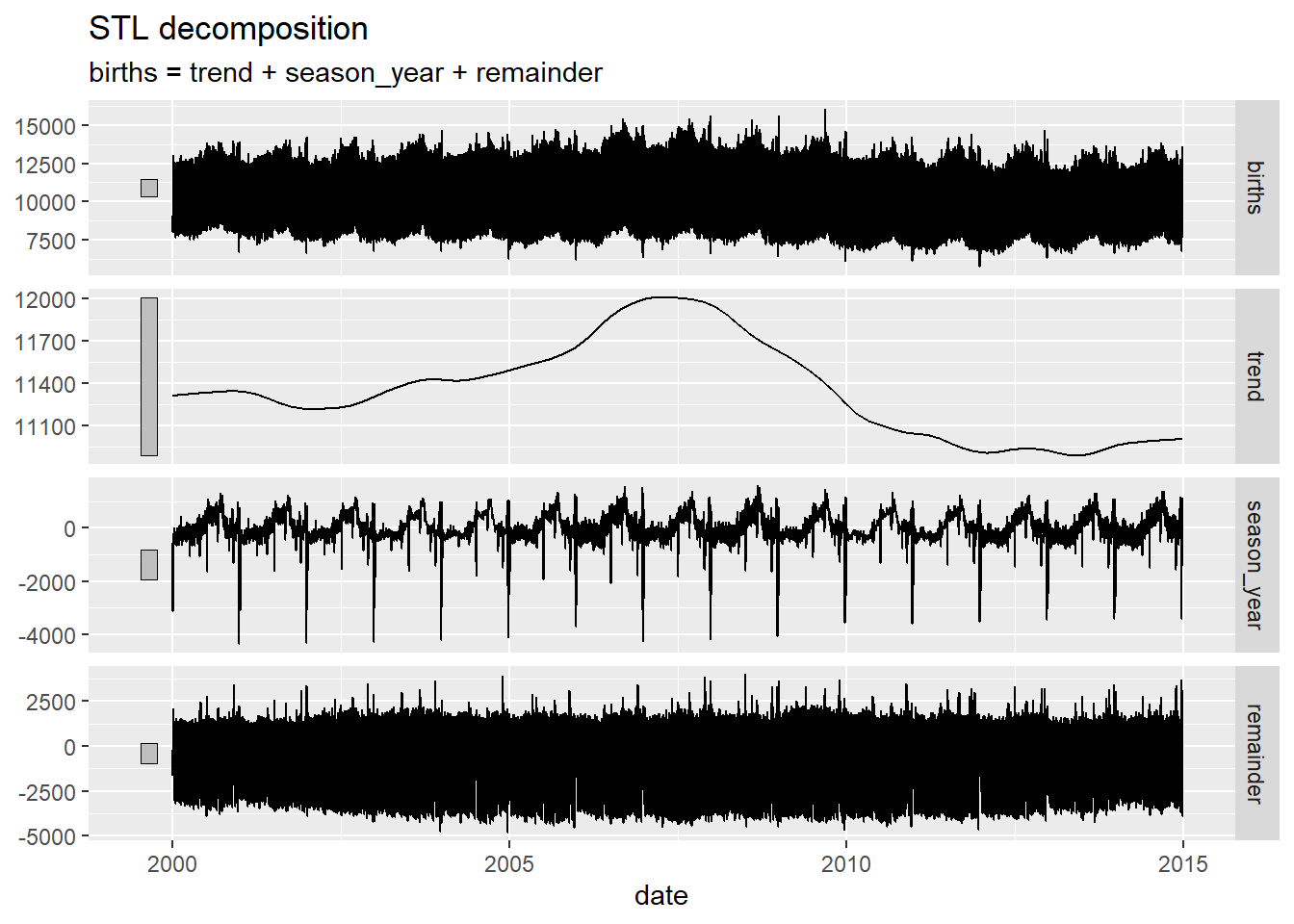
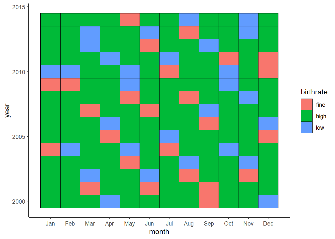
How about a heatmap? We can cook up a categorical variable based on the number of births (low, fine, high) and use that to create a heatmap:
A Workflow in R
Download the RMarkdown tutorial file by clicking the icon above and open it in RStudio or rstudio.cloud.
Arvind V.
My research interests are Complexity Science, Creativity and Innovation, Problem Solving with TRIZ, Literature, Indian Classical Music, and Computing with R.