🖏 Ratings and Rankings
On what Basis do we compare and grade things? How do we represent that?
 Photo by Florian Schmetz on Unsplash
Setup the Packages
knitr::opts_chunk$set(echo = TRUE)
library(tidyverse) # includes ggplot for plotting

library(ggbump) # Bump Charts

library(ggiraphExtra) # Radar, Spine, Donut and Donut-Pie combo charts !!

# install.packages("devtools")
# devtools::install_github("ricardo-bion/ggradar")
library(ggradar) # Radar Plots
What graphs are we going to see today?
When we wish to compare the size of things and rank them, there are quite a few ways to do it.
Bar Charts and Lollipop Charts are immediately obvious when we wish to rank things on one aspect or parameter.
When we wish to rank the same set of objects against multiple aspects or parameters, then we can use Bump Charts and Radar Charts.
Lollipop Charts
# Sample data set
set.seed(1)
df1 <- tibble(x = LETTERS[1:10],
                 y = sample(20:35, 10, replace = TRUE))
df1
## # A tibble: 10 × 2
## x y
## <chr> <int>
## 1 A 28
## 2 B 23
## 3 C 26
## 4 D 20
## 5 E 21
## 6 F 32
## 7 G 26
## 8 H 30
## 9 I 33
## 10 J 21ggplot(df1) +
geom_segment(aes(x = x, xend = x, y = 0, yend = y)) +
geom_point(aes(x = x, y = y, colour = x), size = 5)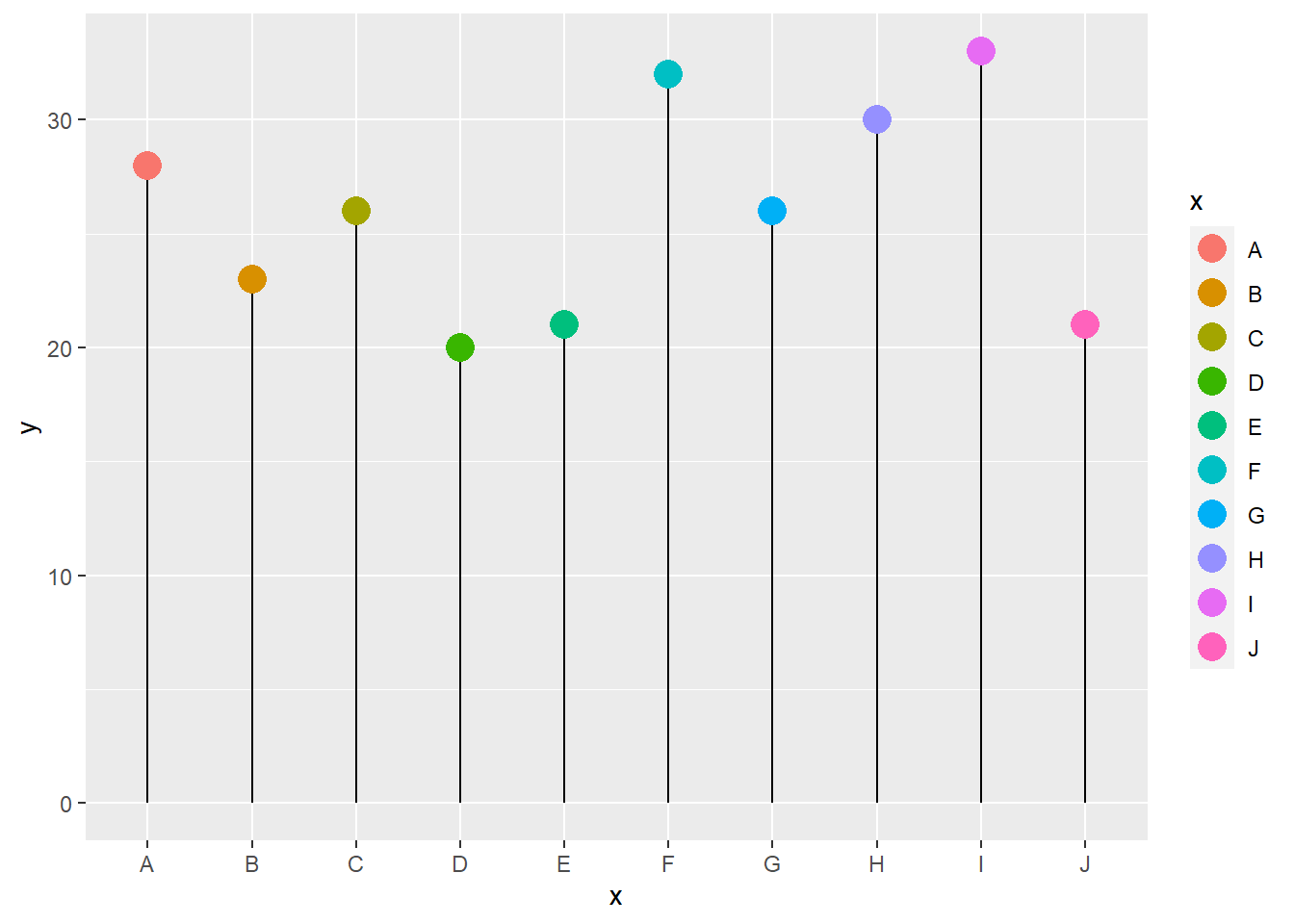
We can flip this horizontally and reorder the \(x\) categories in order
of decreasing ( or increasing ) \(y\), using forcats::fct_reorder:
ggplot(df1) +
  geom_segment(aes(x = fct_reorder(x, -y), # in decreasing order of y
                   xend = fct_reorder(x, -y),
                   y = 0,
                   yend = y)) +
  geom_point(aes(x = x, y = y, colour = x), size = 5) +
  coord_flip() +
  xlab("Group") +
  ylab("") +
  theme_minimal()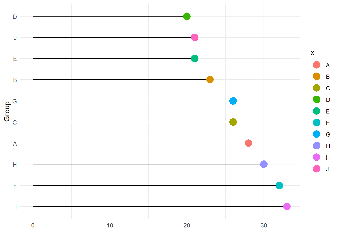
Bump Charts
Bump Charts track the ranking of several objects based on other parameters, such as time/month or even category. We can think of this a a Basis for ranking. For instance, what is the opinion score of a set of products across various categories of users:
year <- rep(2019:2021, 4)
position <- c(4, 2, 2, 3, 1, 4, 2, 3, 1, 1, 4, 3)
product <- c("A", "A", "A",
            "B", "B", "B",
            "C", "C", "C",
            "D", "D", "D")

df2 <- tibble(x = year,
                 y = position,
                 group = product)

df2
## # A tibble: 12 × 3
## x y group
## <int> <dbl> <chr>
## 1 2019 4 A
## 2 2020 2 A
## 3 2021 2 A
## 4 2019 3 B
## 5 2020 1 B
## 6 2021 4 B
## 7 2019 2 C
## 8 2020 3 C
## 9 2021 1 C
## 10 2019 1 D
## 11 2020 4 D
## 12 2021 3 DWe need to use a new package called, what else, ggbump to create our
Bump Charts:
library(ggbump)

ggplot(df2) +
  geom_bump(aes(x = x, y = y, color = group)) +
  geom_point(aes(x = x, y = y, color = group), size = 6) +
  theme_minimal() +
  xlab("Time") +
  ylab("Product Rank") +
  scale_color_brewer(palette = "RdBu") # Change Colour Scale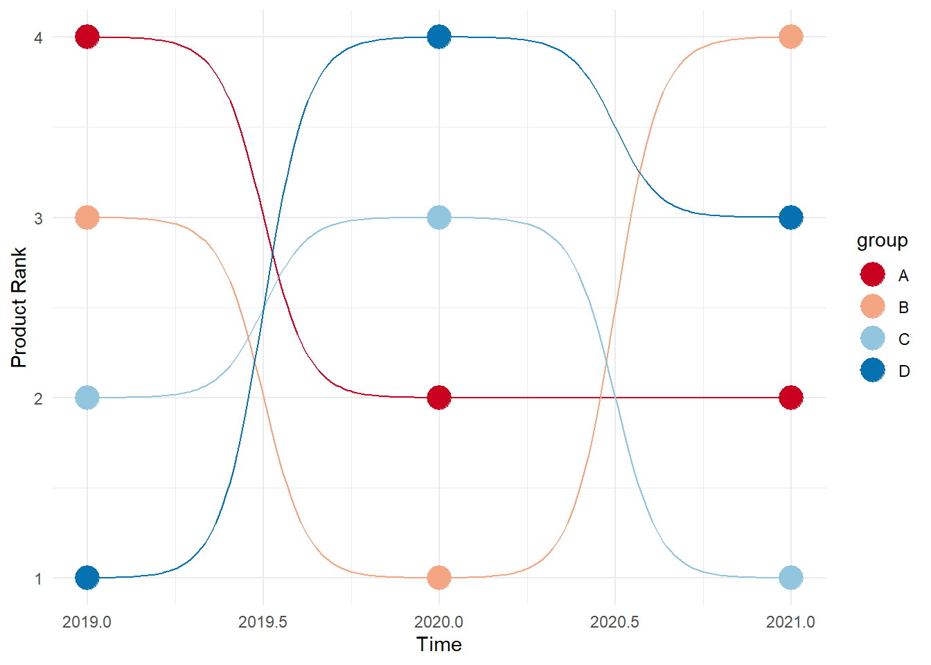
We can add labels along the “bump lines” and remove the legend altogether:
ggplot(df2) +
  geom_bump(aes(x = x, y = y, color = group)) +
  geom_point(aes(x = x, y = y, color = group), size = 6) +
  theme_minimal() +
  scale_color_brewer(palette = "RdBu") + # Change Colour Scale
# Same as before up to her
# Add the labels at start and finish

  geom_text(data = df2 %>% filter(x == min(x)),
            aes(x = x - 0.1, label = group, y = y),
            size = 5, hjust = 1) +
  geom_text(data = df2 %>% filter(x == max(x)),
            aes(x = x + 0.1, label = group, y = y),
            size = 5, hjust = 0) +
  xlab("Time") +
  ylab("Product Rank") +
  theme(legend.position = "none")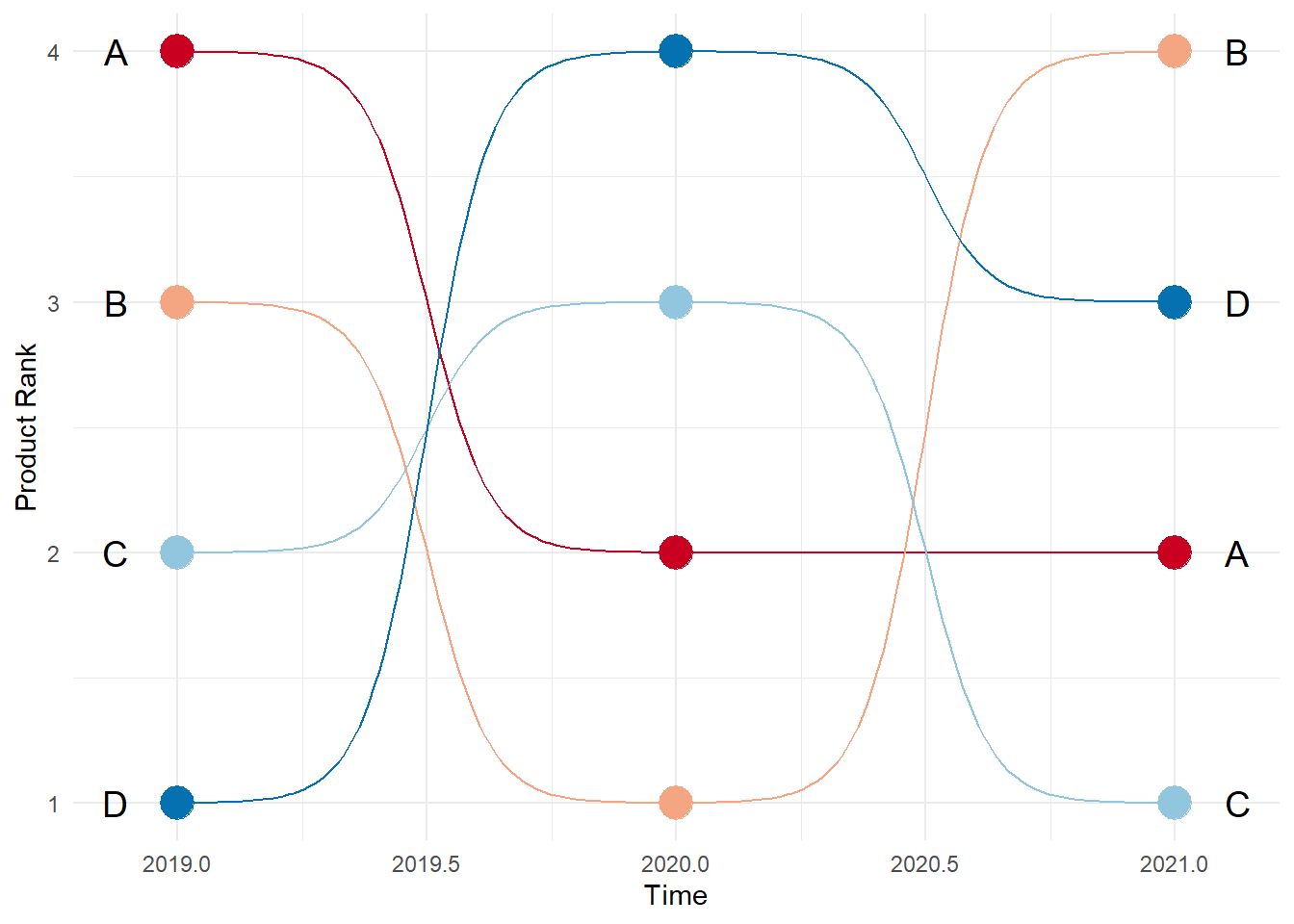
Radar Charts
The same data can be plotted on a roughly circular set of axes, with the radial distance defining the rank against each axes.
Of course, we can use ggradar, which is at this time (Feb 2023) a
development version and not yet part of CRAN. We will still try it, and
another package ggiraphExtra which IS a part of CRAN.
#library(ggradar)

set.seed(4)
df3 <- tibble(Product = c("G1", "G2", "G3"),
              Power = runif(3),
              Cost = runif(3),
              Harmony = runif(3),
              Style = runif(3),
              Size = runif(3),
              Manufacturability = runif(3),
              Durability = runif(3),
              Universality = runif(3))
df3
## # A tibble: 3 × 9
## Product Power Cost Harmony Style Size Manufacturability Durabil…¹ Unive…²
## <chr> <dbl> <dbl> <dbl> <dbl> <dbl> <dbl> <dbl> <dbl>
## 1 G1 0.586 0.277 0.724 0.0731 0.100 0.455 0.962 0.997
## 2 G2 0.00895 0.814 0.906 0.755 0.954 0.971 0.762 0.506
## 3 G3 0.294 0.260 0.949 0.286 0.416 0.584 0.715 0.490
## # … with abbreviated variable names ¹Durability, ²Universalityggradar::ggradar(plot.data = df3,
axis.label.size = 3, # Titles of Params
grid.label.size = 4, # Score Values/Circles
group.point.size = 3,# Product Points Sizes
group.line.width = 1, # Product Line Widths
fill = TRUE, # fill the radar polygons
fill.alpha = 0.3, # Not too dark, Arvind
legend.title = "Product") +
theme_void()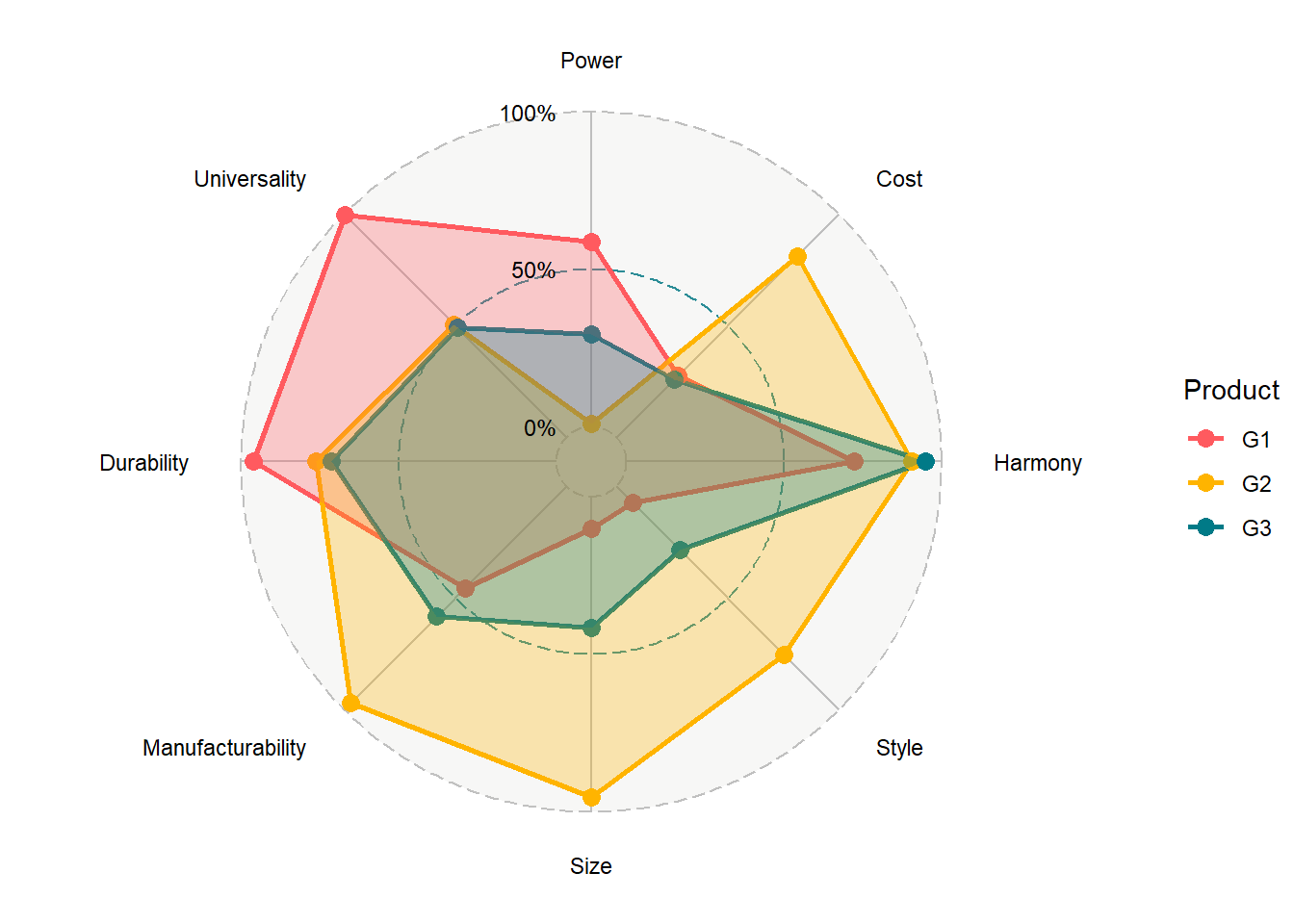
From the ggiraphExtra website:
Package
ggiraphExtracontains many useful functions for exploratory plots. These functions are made by both ‘ggplot2’ and ‘ggiraph’ packages. You can make a static ggplot or an interactive ggplot by setting the parameter interactive=TRUE.
# library(ggiraphExtra)

ggiraphExtra::ggRadar(data = df3,
        aes(colour = Product),
        rescale = FALSE,
          )  + # recale = TRUE makes it look different...try!!
  theme_minimal()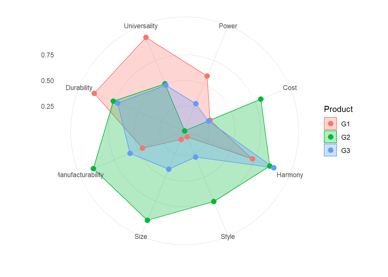
Both render very similar-looking radar charts and the syntax is not too intimidating!!
Your Turn
- Take the
HELPrctdataset from our well usedmosaicDatapackage. Plot ranking charts using each of the public health issues that you can see in that dataset. What choice will you make for the the axes? - Try the
SaratogaHousesdataset also frommosaicData.
References
- Keon-Woong Moon, R Package
ggiraphExtra, https://cran.r-project.org/web/packages/ggiraphExtra/vignettes/introduction.html
Arvind V.
My research interests are Complexity Science, Creativity and Innovation, Problem Solving with TRIZ, Literature, Indian Classical Music, and Computing with R.