🏵 Visualizing Categorical Data
Introduction
To recall, a categorical variable is one for which the possible
measured or assigned values consist of a discrete set of categories,
which may be ordered or unordered. Some typical examples are:
- Gender, with categories “Male,” “Female.”
- Marital status, with categories “Never married,” “Married,” “Separated,” “Divorced,” “Widowed.”
- Fielding position (in
baseballcricket), with categories “Slips,”Cover “,”Mid-off “Deep Fine Leg”, “Close-in”, “Deep”… - Side effects (in a pharmacological study), with categories “None,” “Skin rash,” “Sleep disorder,” “Anxiety,” . . ..
- Political attitude, with categories “Left,” “Center,” “Right.”
- Party preference (in India), with categories “BJP” “Congress,” “AAP,” “TMC.”…
- Treatment outcome, with categories “no improvement,” “some improvement,” or “marked improvement.”
- Age, with categories “0–9,” “10–19,” “20–29,” “30–39,” . . . .
- Number of children, with categories 0, 1, 2, . . . .
As these examples suggest, categorical variables differ in the number of categories: we often distinguish binary variables (or dichotomous variables) such as Gender from those with more than two categories (called polytomous variables).
Categorical Data
From the {vcd package} vignette:
The first thing you need to know is that categorical data can be represented in three different forms in R, and it is sometimes necessary to convert from one form to another, for carrying out statistical tests, fitting models or visualizing the results.
- Case Data
- Frequency Data
- Cross-Tabular Count Data
Let us first see examples of each.
Case Form
Containing individual observations with one or more categorical
factors, used as classifying variables. The total number of observations
is nrow(X), and the number of variables is ncol(X).
names(Arthritis)## [1] "ID" "Treatment" "Sex" "Age" "Improved"class(Arthritis)## [1] "data.frame"glimpse(Arthritis)## Rows: 84
## Columns: 5
## $ ID <int> 57, 46, 77, 17, 36, 23, 75, 39, 33, 55, 30, 5, 63, 83, 66, 4…
## $ Treatment <fct> Treated, Treated, Treated, Treated, Treated, Treated, Treate…
## $ Sex <fct> Male, Male, Male, Male, Male, Male, Male, Male, Male, Male, …
## $ Age <int> 27, 29, 30, 32, 46, 58, 59, 59, 63, 63, 64, 64, 69, 70, 23, …
## $ Improved <ord> Some, None, None, Marked, Marked, Marked, None, Marked, None…From Michael Friendly Discrete Data Analysis and Visualization :
In many circumstances, data is recorded on each individual or experimental unit. Data in this form is called case data, or data in case form.
| ID | Treatment | Sex | Age | Improved |
|---|---|---|---|---|
| 57 | Treated | Male | 27 | Some |
| 46 | Treated | Male | 29 | None |
| 77 | Treated | Male | 30 | None |
| 17 | Treated | Male | 32 | Marked |
| 36 | Treated | Male | 46 | Marked |
| 23 | Treated | Male | 58 | Marked |
The Arthritis data set has three factors and two integer* variables.
One of the three factors Improved is an ordered factor.
- ID
- Treatment: a factor; Placebo or Treated
- Sex: a factor, M / F
- Age: integer
- Improved: Ordinal factor; None < Some < Marked
Frequency Data
Data in frequency form has already been tabulated, by counting over the (combinations of ) categories of the table variables. When the data are in case form, we can always trace any observation back to its individual identifier or data record, since each row is a unique observation or case; the reverse is rarely possible.
Frequency Data is usually a data frame, with columns of categorical
variables and at least one column containing frequency or count
information.
str(GSS)## 'data.frame': 6 obs. of 3 variables:
## $ sex : Factor w/ 2 levels "female","male": 1 2 1 2 1 2
## $ party: Factor w/ 3 levels "dem","indep",..: 1 1 2 2 3 3
## $ count: num 279 165 73 47 225 191GSS %>%
kbl(caption = "General Social Survey",centering = TRUE) %>%
kable_classic_2(html_font = "Cambria", full_width = F,)| sex | party | count |
|---|---|---|
| female | dem | 279 |
| male | dem | 165 |
| female | indep | 73 |
| male | indep | 47 |
| female | rep | 225 |
| male | rep | 191 |
Respondents in the GSS survey were classified by sex and party
identification.
Table form
Table Form Data can be a
matrix,arrayortable object, whose elements are the frequencies in an n-way table. The variable names (factors) and their levels are given bydimnames(X).
HairEyeColor
class(HairEyeColor)
## , , Sex = Male
##
## Eye
## Hair Brown Blue Hazel Green
## Black 32 11 10 3
## Brown 53 50 25 15
## Red 10 10 7 7
## Blond 3 30 5 8
##
## , , Sex = Female
##
## Eye
## Hair Brown Blue Hazel Green
## Black 36 9 5 2
## Brown 66 34 29 14
## Red 16 7 7 7
## Blond 4 64 5 8
##
## [1] "table"HairEyeColor is a “two-way” table, consisting of two tables, one
for Sex = Female and the other for Sex = Male. The total number of
observations is sum(X). The number of dimensions of the table is
length(dimnames(X)), and the table sizes are given by
sapply(dimnames(X), length). The data looks like a n-dimensional cube
and needs n-way tables to represent.
sum(HairEyeColor)
dimnames(HairEyeColor)
sapply(dimnames(HairEyeColor), length)
## [1] 592
## $Hair
## [1] "Black" "Brown" "Red" "Blond"
##
## $Eye
## [1] "Brown" "Blue" "Hazel" "Green"
##
## $Sex
## [1] "Male" "Female"
##
## Hair Eye Sex
## 4 4 2We may need to convert the (multiple) tables into a data frame:
## Convert the two tables into a data frame
HairEyeColor %>%
  as_tibble() %>% # Convert
  head() %>% # Take first few rows to show
  kbl(caption = "Hair Eye and Color (First 6 Entries)") %>%
kable_classic_2(html_font = "Cambria", full_width = F)| Hair | Eye | Sex | n |
|---|---|---|---|
| Black | Brown | Male | 32 |
| Brown | Brown | Male | 53 |
| Red | Brown | Male | 10 |
| Blond | Brown | Male | 3 |
| Black | Blue | Male | 11 |
| Brown | Blue | Male | 50 |
What sort of Plots can we make for Categorical Data?
We have already seen bar plots, which allow us to plot counts of categorical data. However, if there are a large number* of categorical variables or if the categorical variables have many levels, the bar plot is not adequate.
From Michael Friendly:
The familiar techniques for displaying raw data are often disappointing when applied to categorical data. The simple scatterplot, for example, widely used to show the relation between quantitative response and predictors, when applied to discrete variables, gives a display of the category combinations, with all identical values overplotted, and no representation of their frequency.
Instead, frequencies of categorical variables are often best represented graphically using areas rather than as position along a scale. Using the visual attribute:
\[\pmb{area \sim frequency}\]
allows creating novel graphical displays of frequency data for special circumstances.
Let us not look at some sample plots that embody this “area-frequency* principle.
Mosaic Plots
A mosaic plot is basically an area-proportional visualization of (typically observed) frequencies, consisting of tiles (corresponding to the cells) created by vertically and horizontally splitting a rectangle recursively. Thus, the area of each tile is proportional to the corresponding cell entry given the dimensions of previous splits.
The vcd::mosaic() function needs the data in contingency table form. We will use vcd::structable() function to construct one:
art <- vcd::structable(~ Treatment + Improved, data = Arthritis)
art
## Improved None Some Marked
## Treatment
## Placebo 29 7 7
## Treated 13 7 21vcd::mosaic(art, gp = shading_max)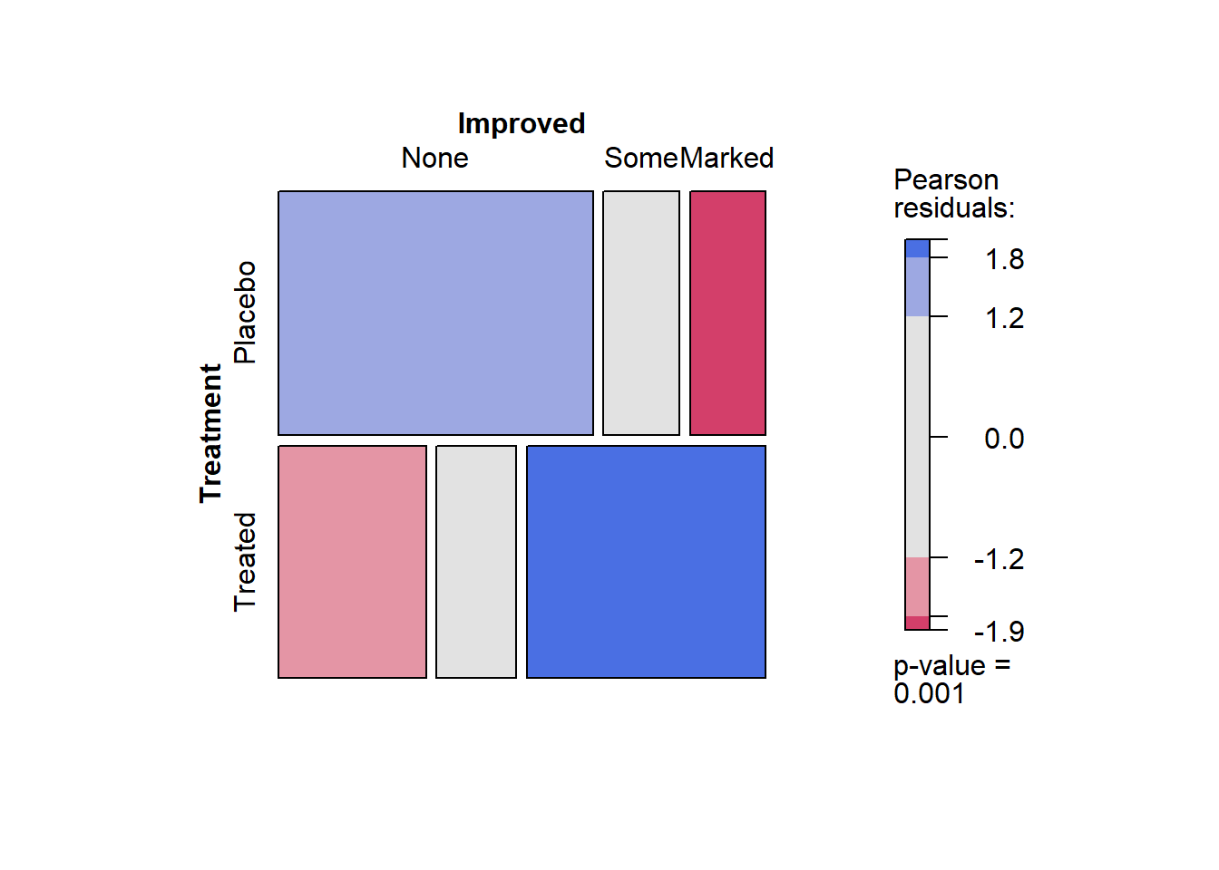
### Or
### vcd::mosaic(structable(~ Treatment + Improved, data = Arthritis), gp = shading_max, split_vertical = TRUE)
Balloon Plots
housetasks <- read.delim(
  system.file("demo-data/housetasks.txt", package = "ggpubr"),
  row.names = 1
  )
head(housetasks, 4)
## Wife Alternating Husband Jointly
## Laundry 156 14 2 4
## Main_meal 124 20 5 4
## Dinner 77 11 7 13
## Breakfeast 82 36 15 7ggballoonplot(housetasks, fill = "value")+
scale_fill_viridis_c(option = "C")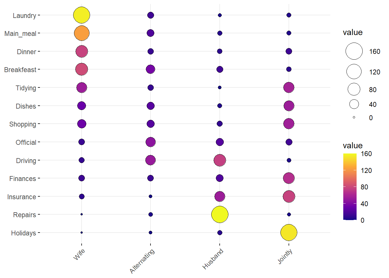
df <- as.data.frame(HairEyeColor)
ggballoonplot(df, x = "Hair", y = "Eye", size = "Freq",
              fill = "Freq", facet.by = "Sex",
              ggtheme = theme_bw()) +
  scale_fill_viridis_c(option = "C")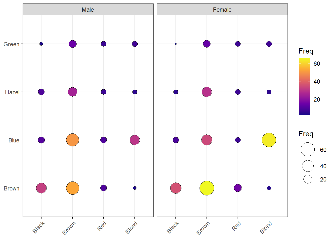
Plots for Likert Data
In many business situations, we perform surveys to get Likert scale
data, where several respondents rate a product or a service on a scale
of Very much like, somewhat like, neutral, Dislike and
Very much dislike. Such data may look for example as follows:
data(efc)
head(efc, 20)
## c12hour e15relat e16sex e17age e42dep c82cop1 c83cop2 c84cop3 c85cop4
## 1 16 2 2 83 3 3 2 2 2
## 2 148 2 2 88 3 3 3 3 3
## 3 70 1 2 82 3 2 2 1 4
## 4 168 1 2 67 4 4 1 3 1
## 5 168 2 2 84 4 3 2 1 2
## 6 16 2 2 85 4 2 2 3 3
## 7 161 1 1 74 4 4 2 4 1
## 8 110 4 2 87 4 3 2 2 1
## 9 28 2 2 79 4 3 2 3 2
## 10 40 2 2 83 4 3 2 1 2
## 11 100 1 1 68 4 3 4 4 4
## 12 25 8 2 97 3 3 3 3 1
## 13 25 2 2 80 4 3 2 2 2
## 14 24 1 2 75 3 3 2 4 4
## 15 56 2 2 82 3 2 3 3 3
## 16 20 2 2 89 3 4 2 1 3
## 17 25 1 1 80 1 3 2 1 2
## 18 126 1 1 72 3 4 2 1 2
## 19 168 2 1 94 3 3 2 1 2
## 20 118 1 1 79 4 3 2 4 2
## c86cop5 c87cop6 c88cop7 c89cop8 c90cop9 c160age c161sex c172code c175empl
## 1 1 1 2 3 3 56 2 2 1
## 2 4 1 3 2 2 54 2 2 1
## 3 1 1 1 4 3 80 1 1 0
## 4 1 1 1 2 4 69 1 2 0
## 5 2 2 1 4 4 47 2 2 0
## 6 3 2 2 1 1 56 1 2 1
## 7 1 2 4 1 4 61 2 2 0
## 8 1 1 2 3 3 67 2 2 0
## 9 2 1 3 1 3 59 2 NA 0
## 10 1 1 1 1 3 49 2 2 0
## 11 4 4 4 1 1 66 2 2 0
## 12 3 1 4 3 1 47 2 2 1
## 13 2 1 2 4 4 58 2 3 0
## 14 1 1 2 4 4 75 1 1 0
## 15 2 2 1 1 1 49 2 3 1
## 16 3 1 2 1 3 56 2 2 0
## 17 1 1 2 4 4 75 2 2 0
## 18 1 1 2 3 3 70 2 2 0
## 19 2 1 3 1 4 52 1 3 1
## 20 1 3 3 2 2 48 2 3 1
## barthtot neg_c_7 pos_v_4 quol_5 resttotn tot_sc_e n4pstu nur_pst
## 1 75 12 12 14 0 4 0 NA
## 2 75 20 11 10 4 0 0 NA
## 3 35 11 13 7 0 1 2 2
## 4 0 10 15 12 2 0 3 3
## 5 25 12 15 19 2 1 2 2
## 6 60 19 9 8 1 3 2 2
## 7 5 15 13 20 0 0 3 3
## 8 35 11 14 20 0 1 1 1
## 9 15 15 13 8 0 2 3 3
## 10 0 10 13 15 1 1 3 3
## 11 25 28 9 1 1 1 3 3
## 12 85 18 8 19 1 1 1 1
## 13 15 13 14 12 0 3 3 3
## 14 70 18 14 8 0 0 1 1
## 15 NA 16 9 8 3 3 0 NA
## 16 0 13 14 6 0 2 0 NA
## 17 95 11 15 16 0 2 0 NA
## 18 55 11 13 14 0 0 2 2
## 19 55 13 13 15 3 1 1 1
## 20 45 17 12 10 0 7 2 2efc is a German data set from a European study on family care of older people. Following a common protocol, data were collected from national samples of approximately 1,000 family carers (i.e. caregivers) per country and clustered into comparable subgroups to facilitate cross-national analysis. One of the research questions in this EUROFAM study was:
What are the main difficulties carers experience accessing the services used? What prevents carers from accessing unused supports that they need? What causes them to stop using still-needed services?
We will select the variables from the efc data set that related to coping (on part of care-givers) and plot their responses after inspecting them:
efc %>% select(dplyr::contains("cop")) %>% str()## 'data.frame': 908 obs. of 9 variables:
## $ c82cop1: num 3 3 2 4 3 2 4 3 3 3 ...
## ..- attr(*, "label")= chr "do you feel you cope well as caregiver?"
## ..- attr(*, "labels")= Named num [1:4] 1 2 3 4
## .. ..- attr(*, "names")= chr [1:4] "never" "sometimes" "often" "always"
## $ c83cop2: num 2 3 2 1 2 2 2 2 2 2 ...
## ..- attr(*, "label")= chr "do you find caregiving too demanding?"
## ..- attr(*, "labels")= Named num [1:4] 1 2 3 4
## .. ..- attr(*, "names")= chr [1:4] "Never" "Sometimes" "Often" "Always"
## $ c84cop3: num 2 3 1 3 1 3 4 2 3 1 ...
## ..- attr(*, "label")= chr "does caregiving cause difficulties in your relationship with your friends?"
## ..- attr(*, "labels")= Named num [1:4] 1 2 3 4
## .. ..- attr(*, "names")= chr [1:4] "Never" "Sometimes" "Often" "Always"
## $ c85cop4: num 2 3 4 1 2 3 1 1 2 2 ...
## ..- attr(*, "label")= chr "does caregiving have negative effect on your physical health?"
## ..- attr(*, "labels")= Named num [1:4] 1 2 3 4
## .. ..- attr(*, "names")= chr [1:4] "Never" "Sometimes" "Often" "Always"
## $ c86cop5: num 1 4 1 1 2 3 1 1 2 1 ...
## ..- attr(*, "label")= chr "does caregiving cause difficulties in your relationship with your family?"
## ..- attr(*, "labels")= Named num [1:4] 1 2 3 4
## .. ..- attr(*, "names")= chr [1:4] "Never" "Sometimes" "Often" "Always"
## $ c87cop6: num 1 1 1 1 2 2 2 1 1 1 ...
## ..- attr(*, "label")= chr "does caregiving cause financial difficulties?"
## ..- attr(*, "labels")= Named num [1:4] 1 2 3 4
## .. ..- attr(*, "names")= chr [1:4] "Never" "Sometimes" "Often" "Always"
## $ c88cop7: num 2 3 1 1 1 2 4 2 3 1 ...
## ..- attr(*, "label")= chr "do you feel trapped in your role as caregiver?"
## ..- attr(*, "labels")= Named num [1:4] 1 2 3 4
## .. ..- attr(*, "names")= chr [1:4] "Never" "Sometimes" "Often" "Always"
## $ c89cop8: num 3 2 4 2 4 1 1 3 1 1 ...
## ..- attr(*, "label")= chr "do you feel supported by friends/neighbours?"
## ..- attr(*, "labels")= Named num [1:4] 1 2 3 4
## .. ..- attr(*, "names")= chr [1:4] "never" "sometimes" "often" "always"
## $ c90cop9: num 3 2 3 4 4 1 4 3 3 3 ...
## ..- attr(*, "label")= chr "do you feel caregiving worthwhile?"
## ..- attr(*, "labels")= Named num [1:4] 1 2 3 4
## .. ..- attr(*, "names")= chr [1:4] "never" "sometimes" "often" "always"The coping related variables have responses on the Likert Scale (1,2,3,4) which correspong to (never, sometimes, often, always), and each variable also has a label defining each variable. We can plot this data using the plot_likert function from package sjPlot:
efc %>% select(dplyr::contains("cop")) %>%
  sjPlot::plot_likert(title = "Caregiver Survey from EUROFAM")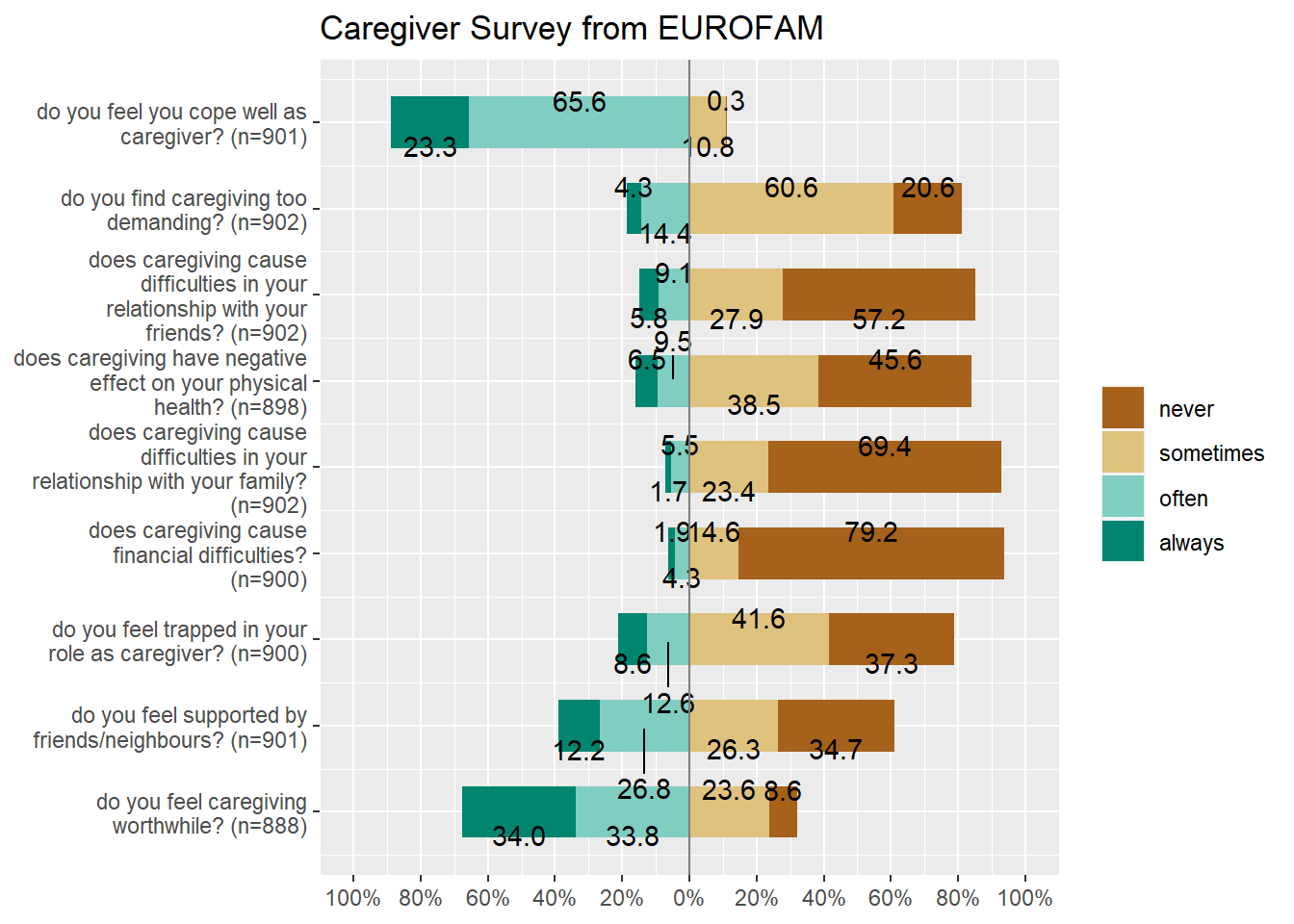
So there we are with Categorical data ! There are a few other plots with this type of data, which are useful in very specialized circumstances. One example of this is the agreement plot which captures the agreement between two (sets) of evaluators, on ratings given on a shared ordinal scale to a set of items. An example from the field of medical diagnosis is the opinions of two specialists on a common set of patients.
We can also do what is called “Correspondence Analysis” with Categorical Data, but that topic must remain for an advanced course.
Conclusion
How are these bar plots different from histograms? Why don’t “regular” plots simply work for Categorical data? Discuss!
References
Using the
strcplotcommand fromvcd, https://cran.r-project.org/web/packages/vcd/vignettes/strucplot.pdfCreating Frequency Tables with
vcd, https://cran.r-project.org/web/packages/vcdExtra/vignettes/A_creating.htmlCreating mosaic plots with
vcd, https://cran.r-project.org/web/packages/vcdExtra/vignettes/D_mosaics.html
Arvind V.
My research interests are Complexity Science, Creativity and Innovation, Problem Solving with TRIZ, Literature, Indian Classical Music, and Computing with R.