 Photo by rawpixel on Unsplash
What graphs will we see today?
Some of the very basic and commonly used plots for data are:
- Bar and Column Charts
- Histograms and Frequency Distributions
- Box Plots
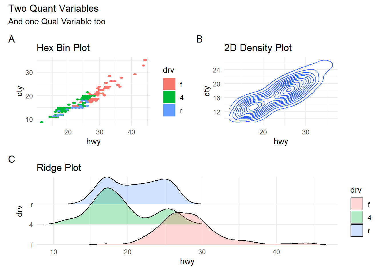
- 2D Hexbins Plots and 2D Frequency Distributions
- Ridge Plots ( Quant + Qual variables)
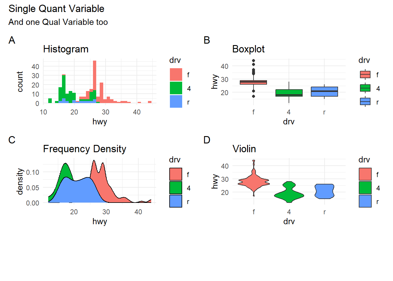
Histograms and Frequency Distributions
Histograms are best to show the distribution of raw quantitative data, by displaying the number of values that fall within defined ranges, often called buckets or bins.
Although histograms may look similar to column charts, the two are different. First, histograms show continuous data, and usually you can adjust the bucket ranges to explore frequency patterns. For example, you can shift histogram buckets from 0-1, 1-2, 2-3, etc. to 0-2, 2-4, etc. By contrast, column charts show categorical data, such as the number of apples, bananas, carrots, etc. Second, histograms do not usually show spaces between buckets because these are continuous values, while column charts show spaces to separate each category.
Let us listen to the late great Hans Rosling from the Gapminder Project, which aims at telling stories of the world with data, to remove systemic biases about poverty, income and gender related issues.
How many are rich and how many are poor? from Gapminder on Vimeo.
Examine the Data
Let us look at the popular mpg dataset ( from R ) using mosaic::inspect(). We get two new pieces of output (i.e. two new dataframes), describing the Qual and Quant variables separately:
##
## categorical variables:
##           name     class levels   n missing
## 1 manufacturer character     15 234       0
## 2        model character     38 234       0
## 3        trans character     10 234       0
## 4          drv character      3 234       0
## 5           fl character      5 234       0
## 6        class character      7 234       0
##                                    distribution
## 1 dodge (15.8%), toyota (14.5%) ...
## 2 caravan 2wd (4.7%) ...
## 3 auto(l4) (35.5%), manual(m5) (24.8%) ...
## 4 f (45.3%), 4 (44%), r (10.7%)
## 5 r (71.8%), p (22.2%), e (3.4%) ...
## 6 suv (26.5%), compact (20.1%) ...
##
## quantitative variables:
##    name   class    min     Q1 median     Q3  max        mean       sd   n
## 1 displ numeric    1.6    2.4    3.3    4.6    7    3.471795 1.291959 234
## 2  year integer 1999.0 1999.0 2003.5 2008.0 2008 2003.500000 4.509646 234
## 3   cyl integer    4.0    4.0    6.0    8.0    8    5.888889 1.611534 234
## 4   cty integer    9.0   14.0   17.0   19.0   35   16.858974 4.255946 234
## 5   hwy integer   12.0   18.0   24.0   27.0   44   23.440171 5.954643 234
##   missing
## 1       0
## 2       0
## 3       0
## 4       0
## 5       0
We can save and see the outputs separately: (code not run)
There is a lot of Description generated by the mosaic::inspect() command !
What can we say about the dataset and its variables? How big is the dataset? How many variables? What types are they, Quant or Qual? If they are Qual, what are the levels? Are they ordered levels? Discuss!
Some Sample Charts for Quant Data Distributions
A Workflow in Orange
How does one visualize Distributions in Orange?
Conclusion
- Histograms, Frequency Distributions, and Box Plots are used for Quantitative data variables
- Histograms “dwell upon” counts, ranges, means and standard deviations
- Frequency Density plots “dwell upon” probabilities and densities
- Box Plots “dwell upon” medians and Quartiles
- Qualitative data variables can be plotted as counts, using Bar Charts, or using Heat Maps
- 2D density plots are used for describing two quant variables*
- Ridge Plots are density plots used for describing one Quant and one Qual variable (by inherent splitting)
- We can split all these plots on the basis of another Qualitative variable.(Ridge Plots are already split)
Your Turn
- Try one of these datasets (download and unzip this file)
- A dataset from calmcode.io https://calmcode.io/datasets.html
- Old Faithful Data in R
inspect the dataset in each case and develop a set of Questions, that can be answered by appropriate stat measures, or by using a chart to show the distribution.
References
See the scrolly animation for a histogram at this website: Exploring Histograms, an essay by Aran Lunzer and Amelia McNamara https://tinlizzie.org/histograms/?s=09
Minimal R using
mosaic. https://cran.r-project.org/web/packages/mosaic/vignettes/MinimalRgg.pdf
Arvind V.
My research interests are Complexity Science, Creativity and Innovation, Problem Solving with TRIZ, Literature, Indian Classical Music, and Computing with R.