🌊 Evolution and Flow
Changes in Information over space and time
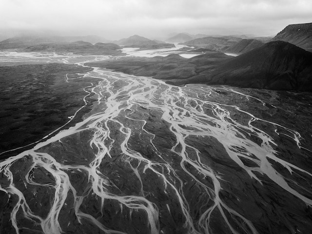 Photo by ArtHouse Studio (https://www.pexels.com/photo/river-delta-and-majestic-mountain-landscape-4337896/)
Introduction
What do we mean by “evolution” here? We mean data that changes in category or membership over time or space. The dataset may contain only categories and the time and space parameters may be implicit.
A visual example: what does the graph below depict?
This diagram show how energy is converted or transmitted before being consumed or lost: supplies are on the left, and demands are on the right. (Data: UK Department of Energy & Climate Change via Tom Counsell)
An example in words: Students opting for different courses during a semester at college. What axes would you include in your plot?
Packages that we will need
knitr::opts_chunk$set(echo = TRUE)

library(tidyverse)
## ── Attaching packages ─────────────────────────────────────── tidyverse 1.3.2 ──
## ✔ ggplot2 3.4.1 ✔ purrr 1.0.1
## ✔ tibble 3.1.8 ✔ dplyr 1.1.0
## ✔ tidyr 1.3.0 ✔ stringr 1.5.0
## ✔ readr 2.1.4 ✔ forcats 1.0.0
## ── Conflicts ────────────────────────────────────────── tidyverse_conflicts() ──
## ✖ dplyr::filter() masks stats::filter()
## ✖ dplyr::lag() masks stats::lag()library(patchwork)
library(ggstream) # stream plots in R
library(ggalluvial)Time Evolution Charts
In these cases, the x-axis is typically time…and we chart the variable of another Quant variable with respect to time, using a line geometry.
Let is take a healthcare budget dataset fromOur World in Data: We will plot graphs for 5 countries (India, China, Brazil, Russia, Canada ). Download this data by clicking the button below and save into your Project folder.
health <-
read_csv("data/public-health-expenditure-share-GDP-OWID.csv")health_filtered <- health %>%
filter(Entity %in% c(
"India",
"China",
"United States",
"United Kingdom",
"Russia",
"Sweden"
))
p1 <- ggplot(health_filtered,
aes(x = Year,
y = public_health_expenditure_pc_gdp,
colour = Entity)) +
geom_line() +
labs(y = "Healthcare Budget\n as % of GDP")
p2 <-
ggplot(health_filtered,
aes(x = Year,
y = public_health_expenditure_pc_gdp,
fill = Entity)) + geom_area() +
labs(y = "Healthcare Budget\n as % of GDP")
p1 / p2 + plot_layout(nrow = 2) +
plot_annotation(title = "Line and Area Charts to show Evolution (over Time )",
subtitle = "",
tag_levels = 'A') &
theme_minimal()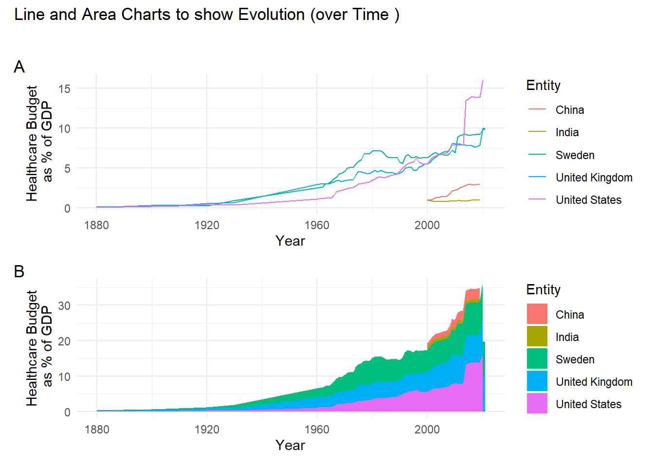
What Space Evolution Charts can we plot?
Here, the space can be any Qual variable, and we can chart another Quant or Qual variable move across levels of the first chosen Qual variable.
For instance we can contemplate Enrollment at a University, and show how students move from course to course in a University. Or how customers drift from one category of products or brands to another….or the movement of cricket players from one IPL Team to another !!
A sankey diagram is a visualization used to depict a flow from one set of values to another. The things being connected are called nodes and the connections are called links. Sankeys are best used when you want to show a many-to-many mapping between two domains or multiple paths through a set of stages.
knitr::include_graphics("images/sankey.png")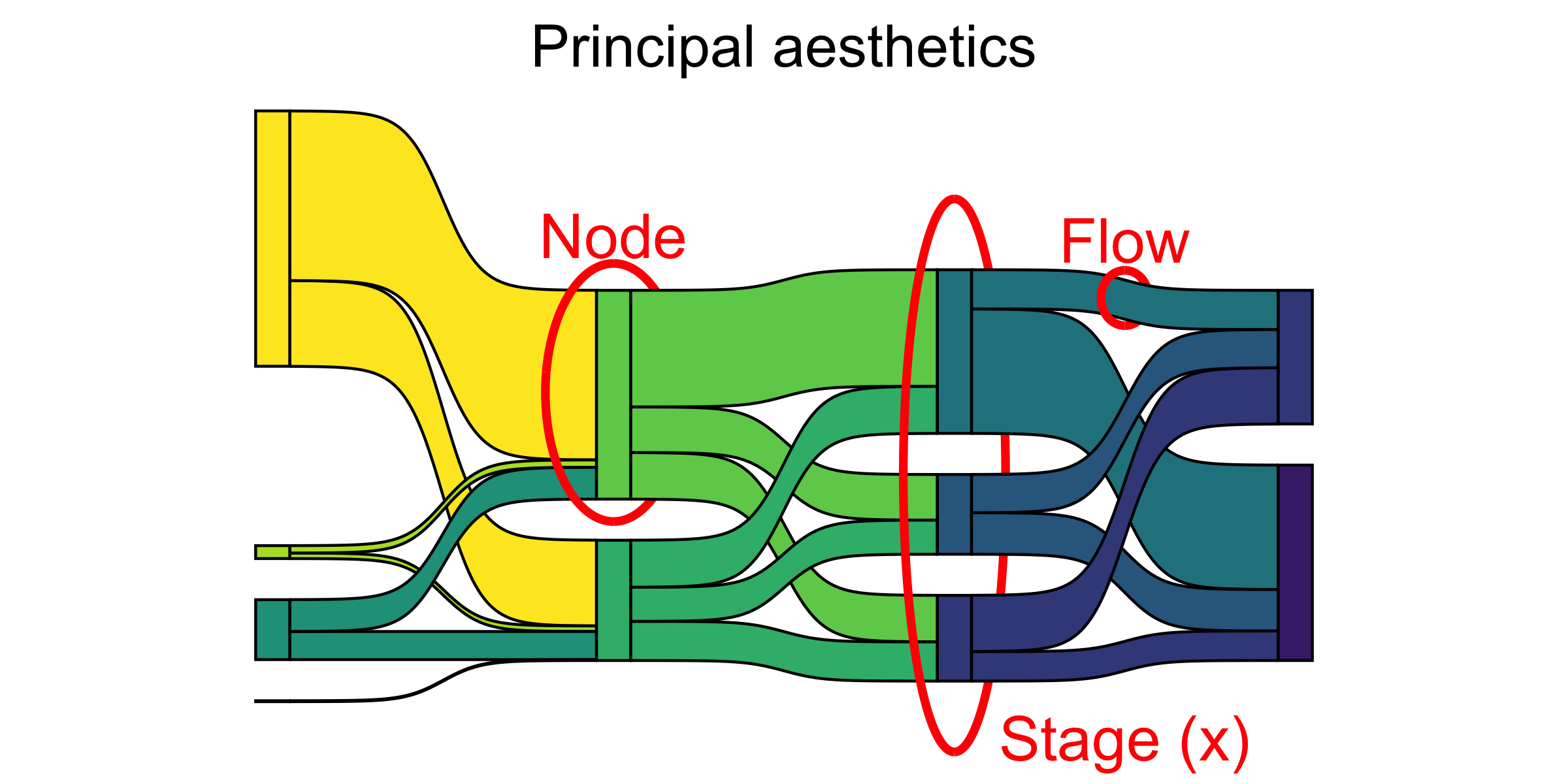
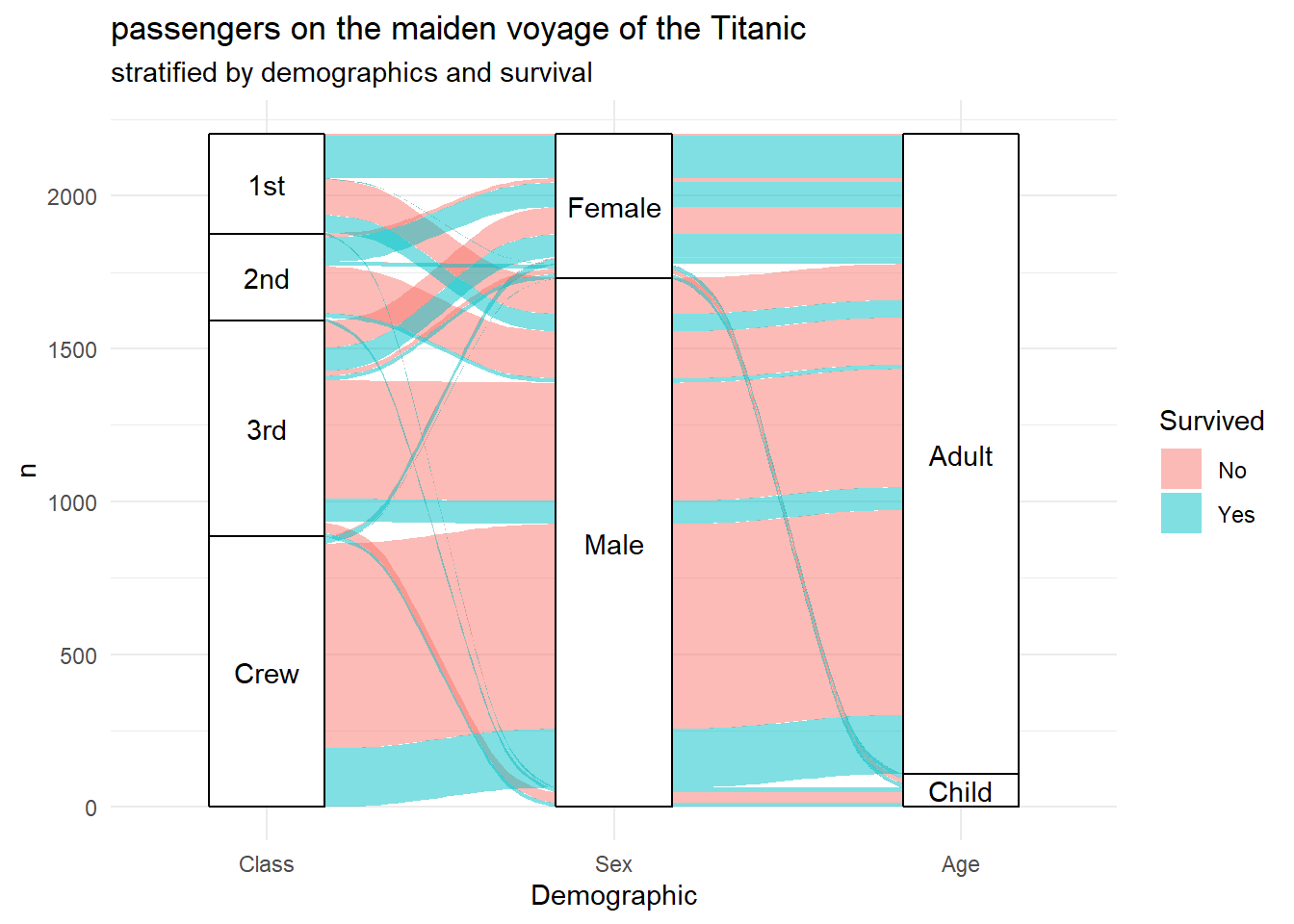
Let us look at the famous Titanic Dataset:
Conclusion
Evolution can be over time, or over space/categories/affiliations or both, where the time part is implicit in the way the categories are depicted.
Your Turn
Head off to the International Energy Agency’s webpage for free Energy related datasets. Plot Sankey and Time Graphs for a dataset of your choice.
Download the Chinese Companies’ Cashflow Dataset from Kaggle.com. Choose a few companies from the list and plot time evolution and Sankey Diagrams for their various cash flows.
References
MINARD’S MAPS AND SANKEY’S DIAGRAMS, https://www.studioalicino.it/en/blog/minard’s-maps-and-sankey’s-diagrams
Data-to-Viz Sankey Diagram Page https://www.data-to-viz.com/graph/sankey.html
Global Migration, https://download.gsb.bund.de/BIB/global_flow/ A good example of the use of a Chord Diagram.
EuroStat Energy Flow Diagram Tool. https://ec.europa.eu/eurostat/web/energy/energy-flow-diagrams
Internation Energy Agency. India https://www.iea.org/sankey/#?c=India&s=Balance
Sankey Diagrams in Excel:
Arvind V.
My research interests are Complexity Science, Creativity and Innovation, Problem Solving with TRIZ, Literature, Indian Classical Music, and Computing with R.